Rebranding a Layer 1 around its agentic vision.
Client
Services
Sub-brand system
Brand guidelines
Social & campaign assets
Website illustration & design
Description
One mark. One system. Nine sub-brands. Built for the chain where agents live onchain.
Industry
Timeline
2-month retainer
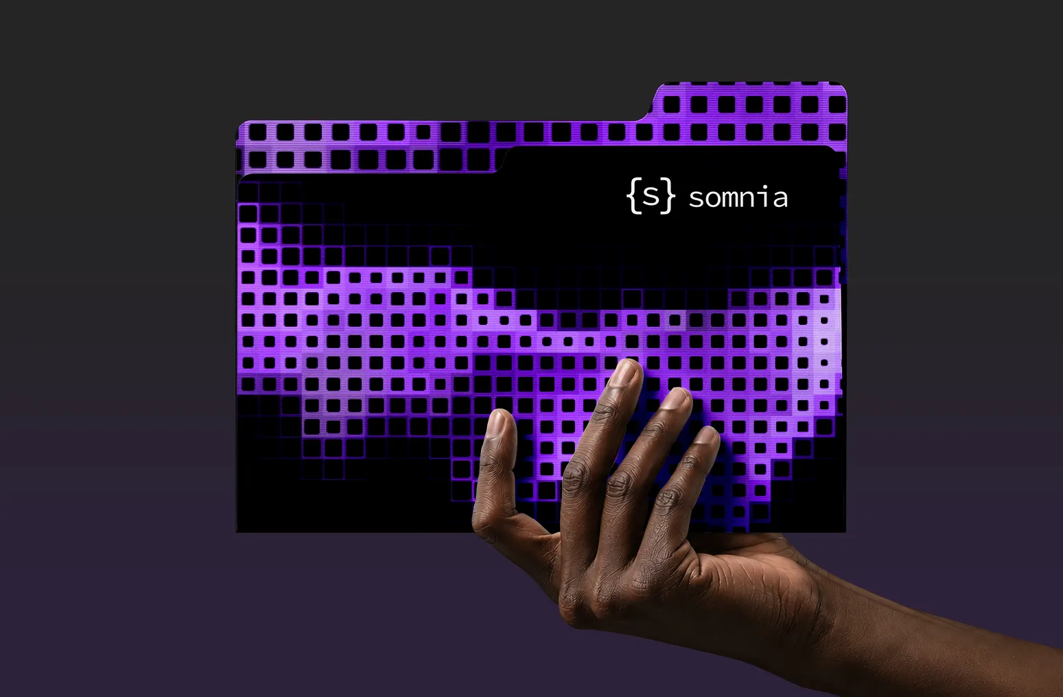
Overview
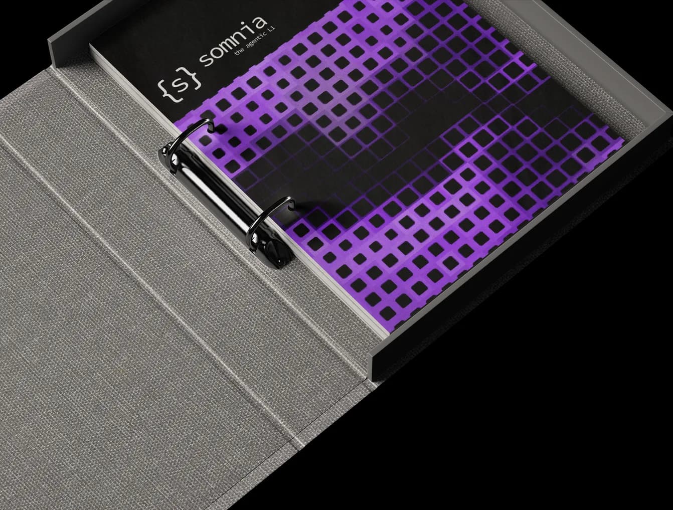
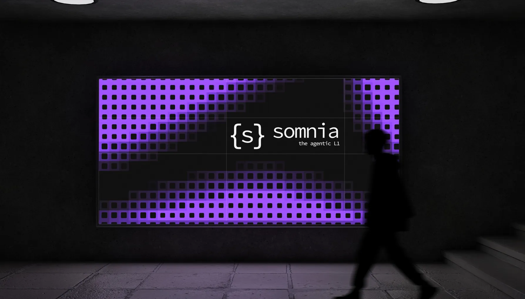
Somnia's product outgrew its brand. The chain was building agents that pull live data, run AI and react onchain in real time. The old identity showed none of that and blended in with every other L1. We rebuilt the visual system around the agentic vision, so it can do the heavy lifting for them.
System
9
Sub-brands running on one system
Exploration
3 rounds
Of exploration before the final route
Partnership
2 months
Retainer on assets and the website after launch
01About the project
Somnia moved to agents.
The brand stayed behind.
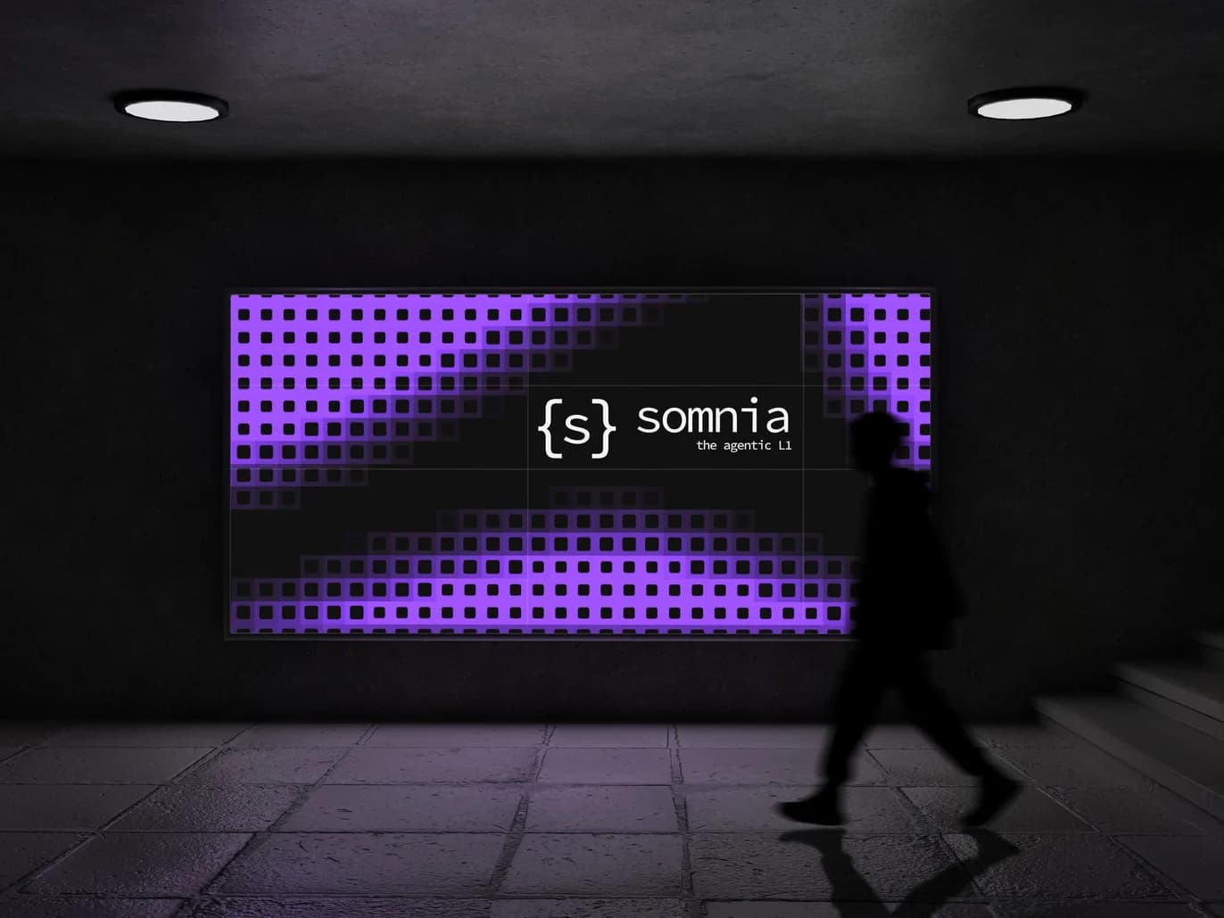
Somnia launched as a fast EVM Layer 1 for real-time consumer apps. Games, social, metaverse. Then the company shifted its focus to agents, onchain programs that pull live data, run AI and react in real time. The product moved on. The brand didn't. It still spoke to gamers, blended in with every other L1 and no longer represented the company, and that started hurting sales.
We were brought in to build the identity for “The Agentic L1”, then make it work across a growing family of sub-brands. After the rebrand, we stayed on for a two-month retainer, producing assets and working on the website with the Somnia team.
02The challenge
Look like the agentic chain,
not one more L1.
L1 brands tend to look alike. Gradients, glossy coins, a stylized letter. Somnia needed a look that said agents at first glance, and one that could stretch across every product in the ecosystem.
A
A pivot the brand never made
Somnia went from gaming to agents. The identity didn't follow, and it started costing them sales.
B
A vision with no visual language
Agents were the new story. Nothing in the brand showed it, and Somnia looked like any other L1.
C
Nine sub-brands, one family
dreamDEX and Prophecy were going live in Q2, each needing its own logo and lead color. Network, Ecosystem, Games, Devs, Yappers, Foundation and Intern needed the same, without breaking the family.
D
Two audiences, one of them machines
Traders, builders and KOLs had to trust it. AI agents had to look like its native users.
03Brand discovery
Looks good to humans.
Built for agents.
Agents boot, scan, fetch and execute. They work inside defined boundaries and act on their own. Every direction we explored had to show that behavior, not just name it.
The brief set one critical test. The brand had to work for institutional traders, market makers, KOLs, builders and mass-market traders, and still feel like it was designed for AI agents and LLMs. Clean, contemporary, different from every other chain, and at home in the agentic future. We studied the agent-native brands the team admired to see where the category already was, and where Somnia could stand apart.
04Round one: five directions
We went wide first.
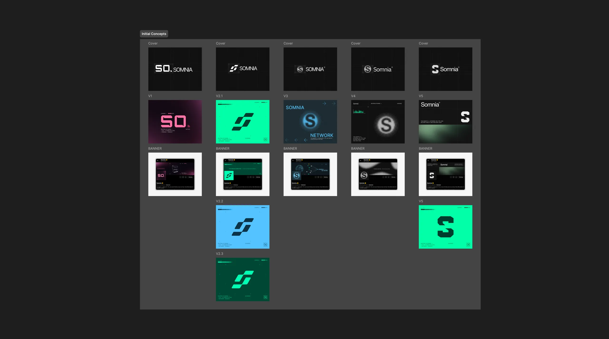
Five directions, each shown in context on X covers, so the team could judge them where the brand would actually live. A pixel “SO.” wordmark in pink. A slanted, speed-led S in green. A networked S in blue. A grayscale S built from light. A minimal, bold S.
05Round two: put to work
Three directions moved forward,
each tested on a real asset.
We took the green S, the gradient circular S and the purple S, and ran each one through a live campaign, the $10K travel voucher giveaway, in dark and light. A logo that looks good on its own can fall apart on a real banner. This round showed which ones held up.
06Round three: the pixel S
One mark, refined until it cleared
every review but the last.
The circular S, rebuilt from a grid of pixels in Somnia purple. We tested the silhouette slimmer, thicker and with more depth, then put it on covers and merch. It was approved at every level up to the CEO.


07Back to first principles
The last review sent us back
to first principles.
Instead of polishing the pixel S, we asked a simpler question. What does an agent actually look like? It looks like code. So we stopped drawing a symbol and wrote one.
The new route was simpler and more agentic. A monospace mark, a terminal-inspired language and a system built to scale across every sub-brand.
08The mark
{s}. A syntax-like symbol for
a chain built for agents.
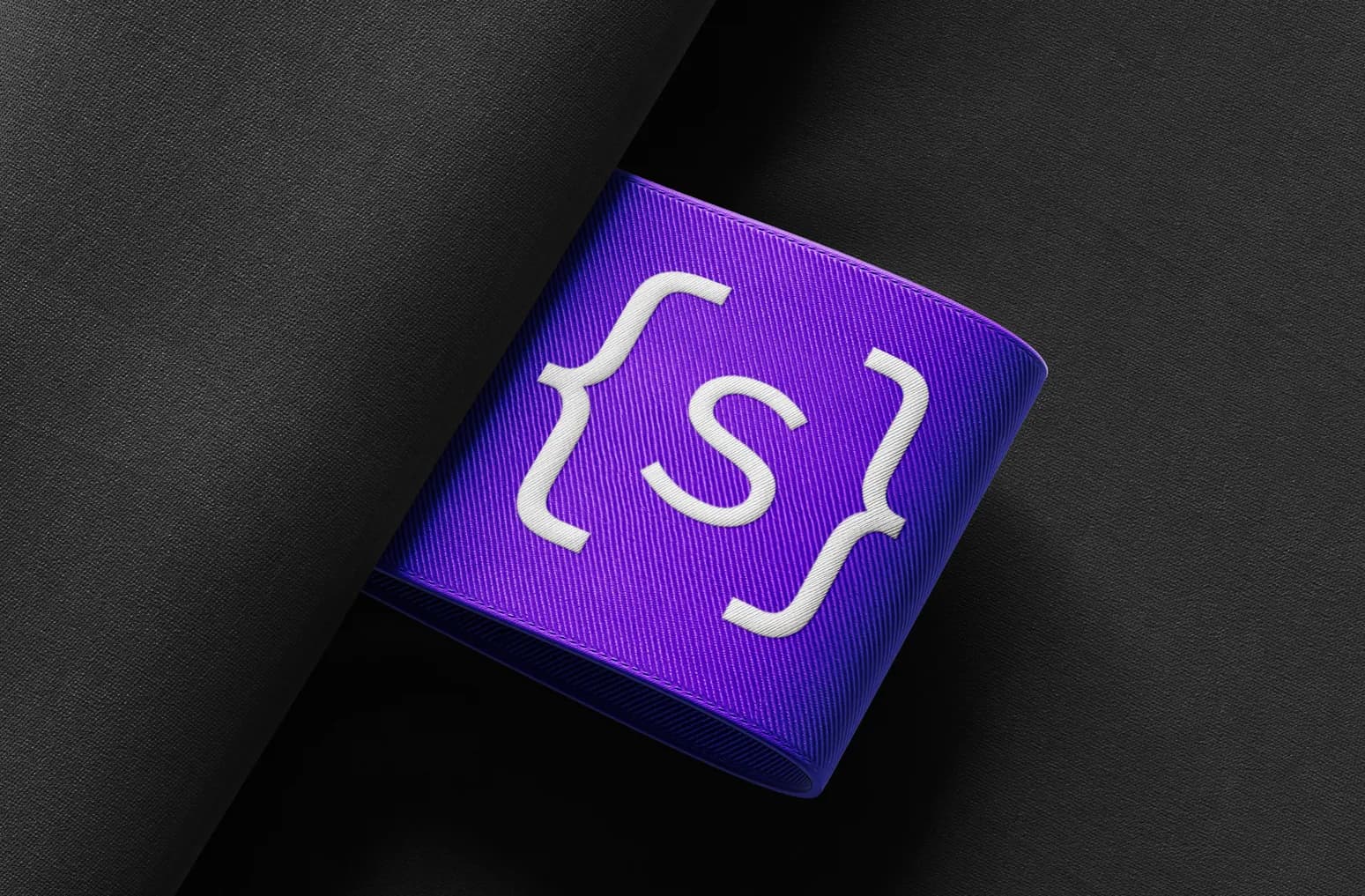
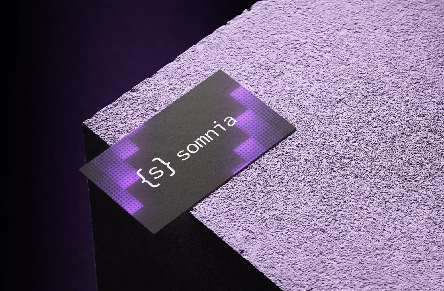
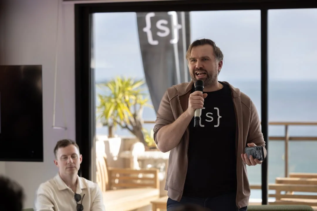
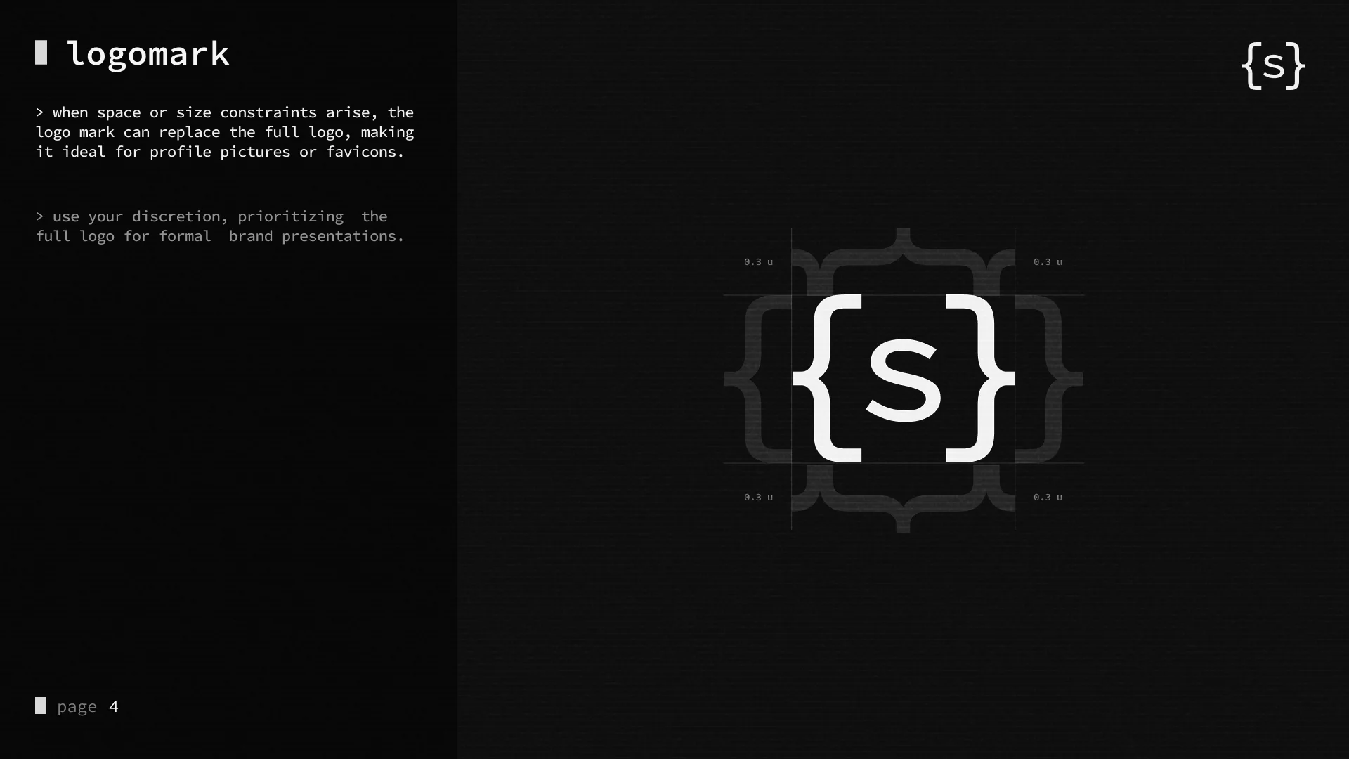
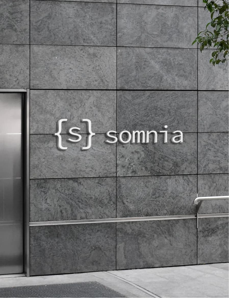
The logo is a monospace S inside curly braces. In code, braces define a scope. Here they stand for agents gathering inputs, data and workflows within defined boundaries, then executing. Built from type, it reads as one compact unit. It answers the brief directly. Humans see a clean, confident mark. Agents see syntax.
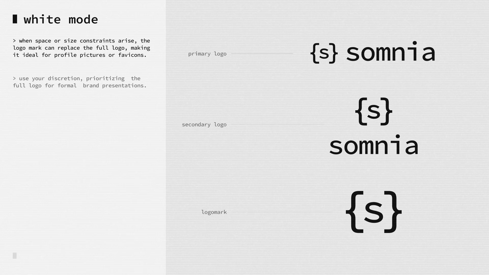
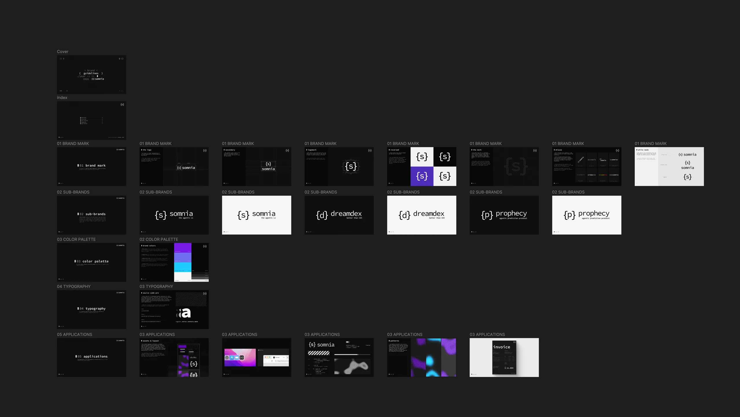
The system covers a primary logo, a stacked secondary logo, a logomark for avatars and favicons, reversed and white-mode versions, and clear misuse rules.
09Typography
Source Code Pro, everywhere.
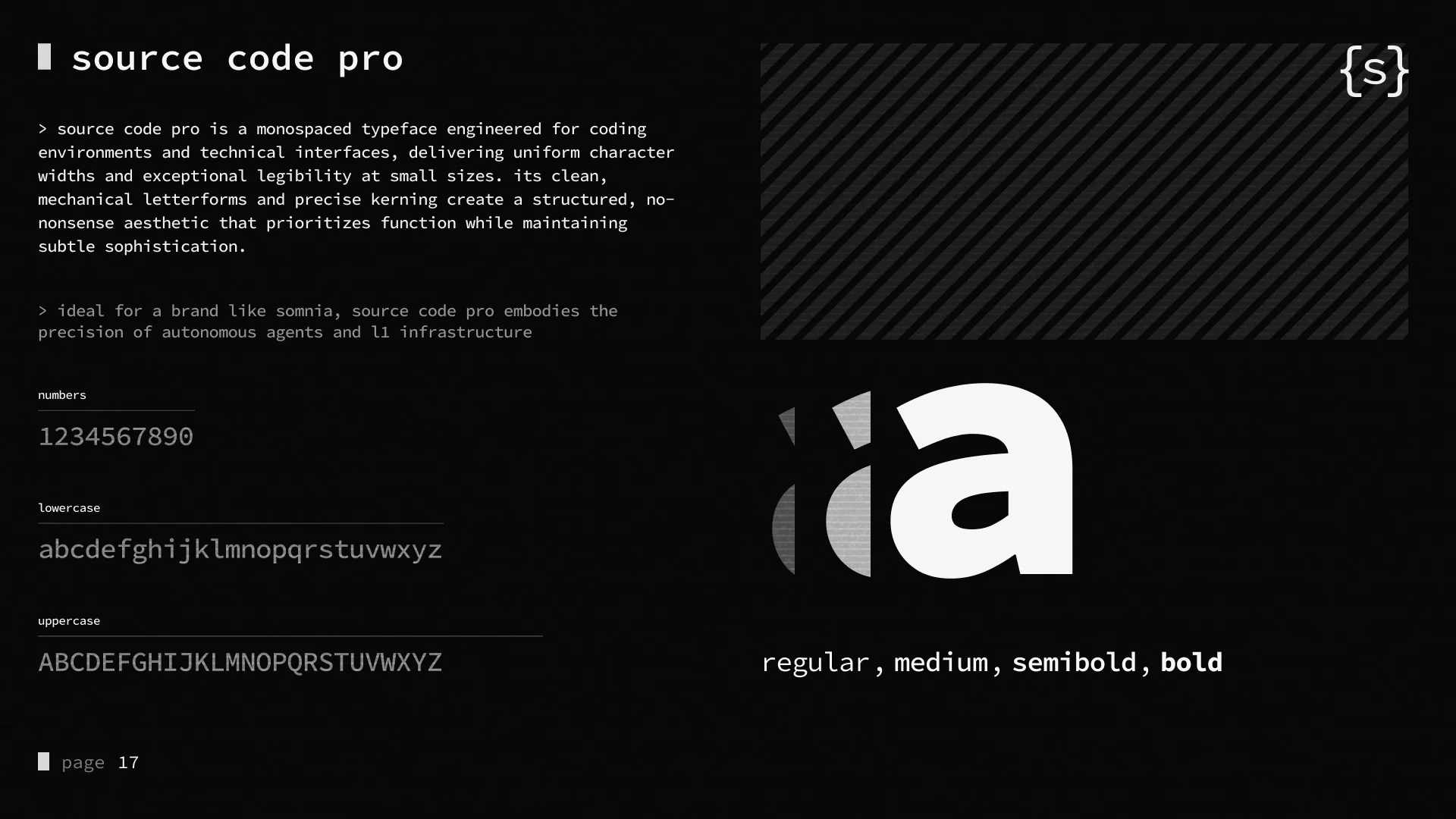
A monospaced typeface built for code. Uniform character widths, sharp legibility at small sizes and a mechanical, precise feel that matches autonomous agents and L1 infrastructure. It sets the logo, headlines and body, so the whole brand reads like one terminal.
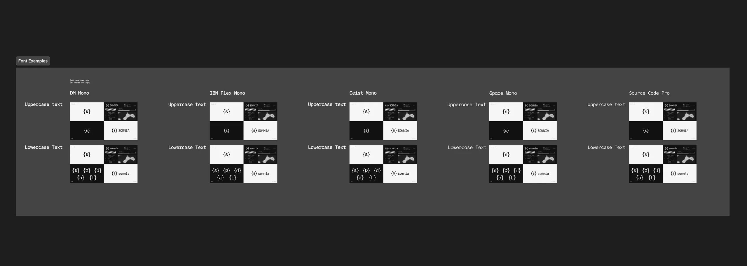
We tested it against IBM Plex Sans, Inter Tight and Arial. They all read clean, but they read like every other tech brand. Only the monospace looked like something an agent would write.
10Color system
Somnia purple at the core. A new
accent for every sub-brand.
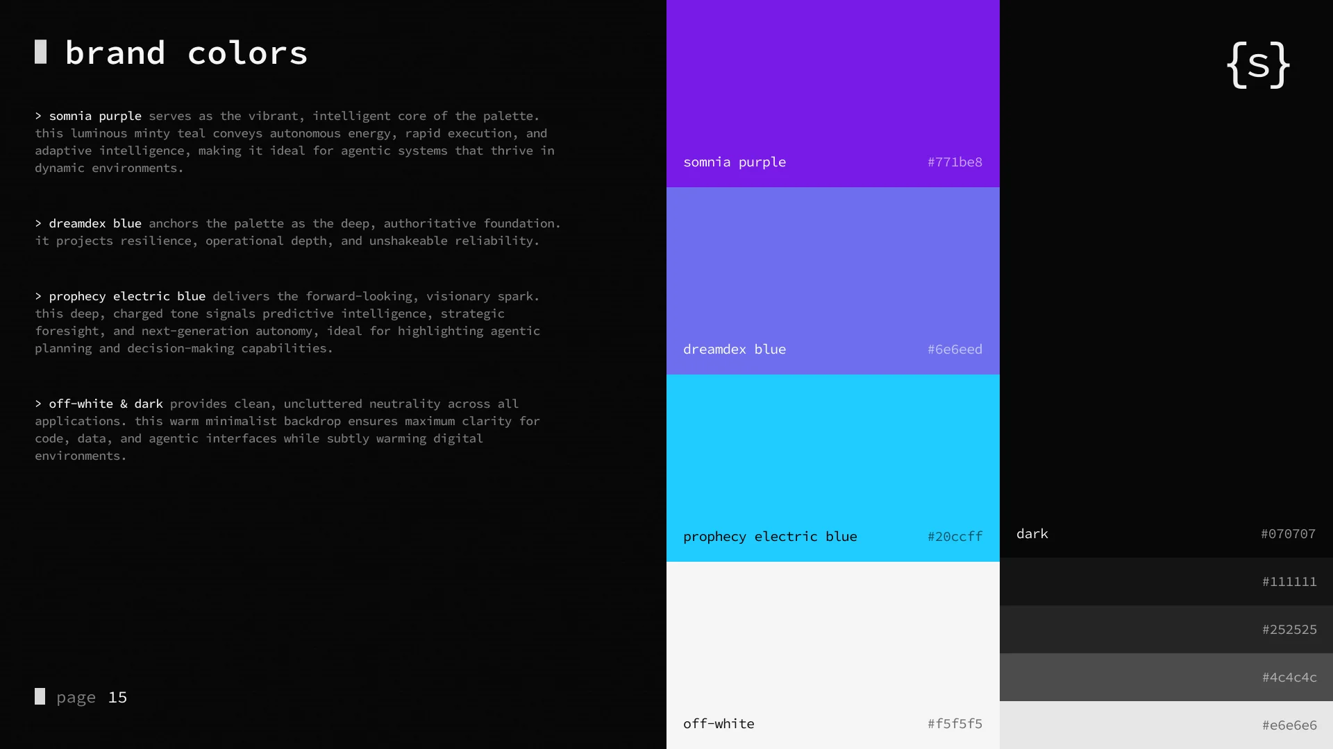
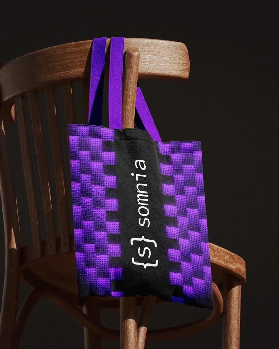
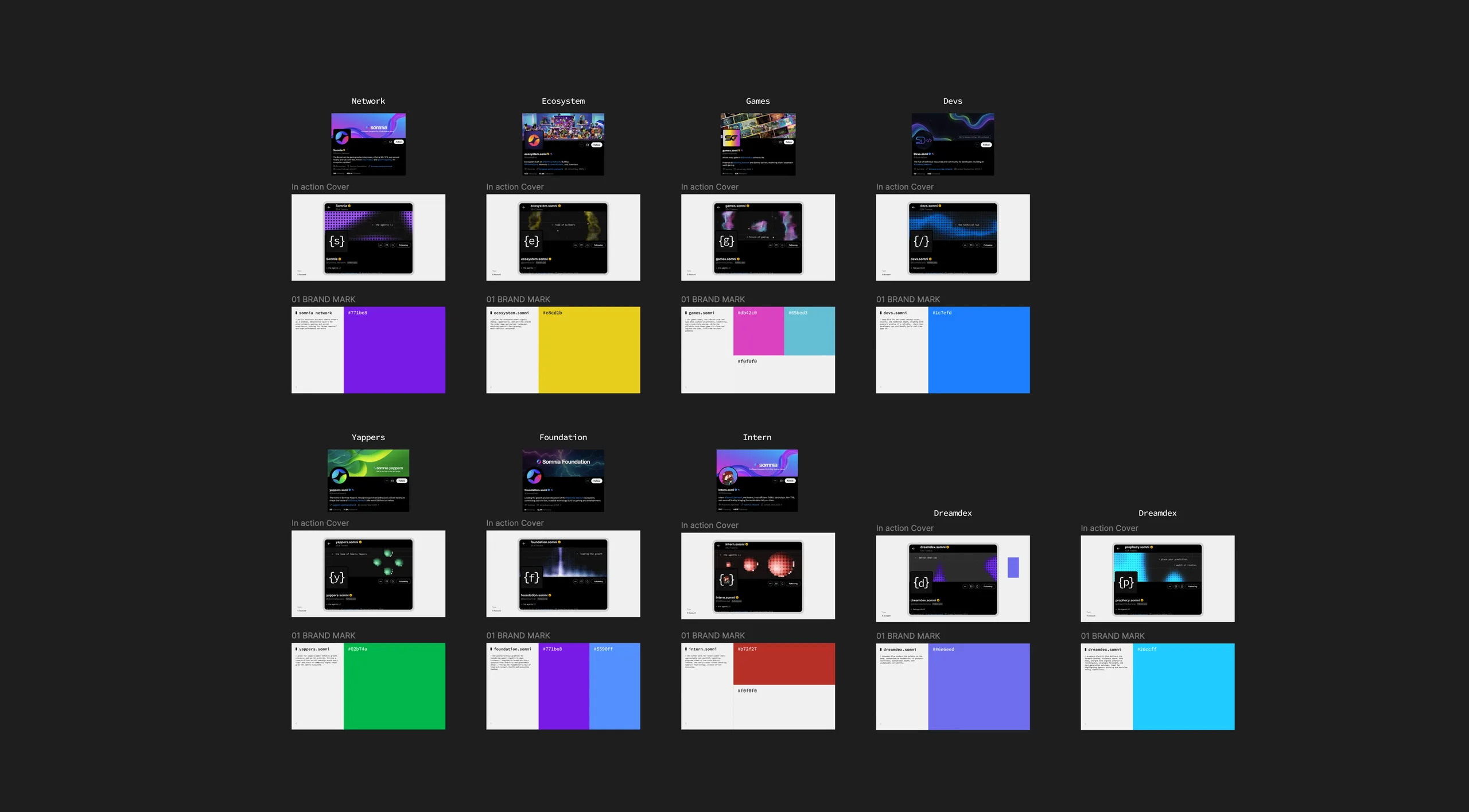
Black backgrounds and off-white type carry the brand. Somnia Purple stays at the core, kept on purpose for continuity with the brand people already knew. Each sub-brand keeps the same grid and switches only its accent, so Dreamdex, Prophecy and the rest can claim their own territory and still read as Somnia. Some accents took a few passes. Devs moved from blue to orange before it locked.
11Sub-brand system
One letter, one color, nine brands.
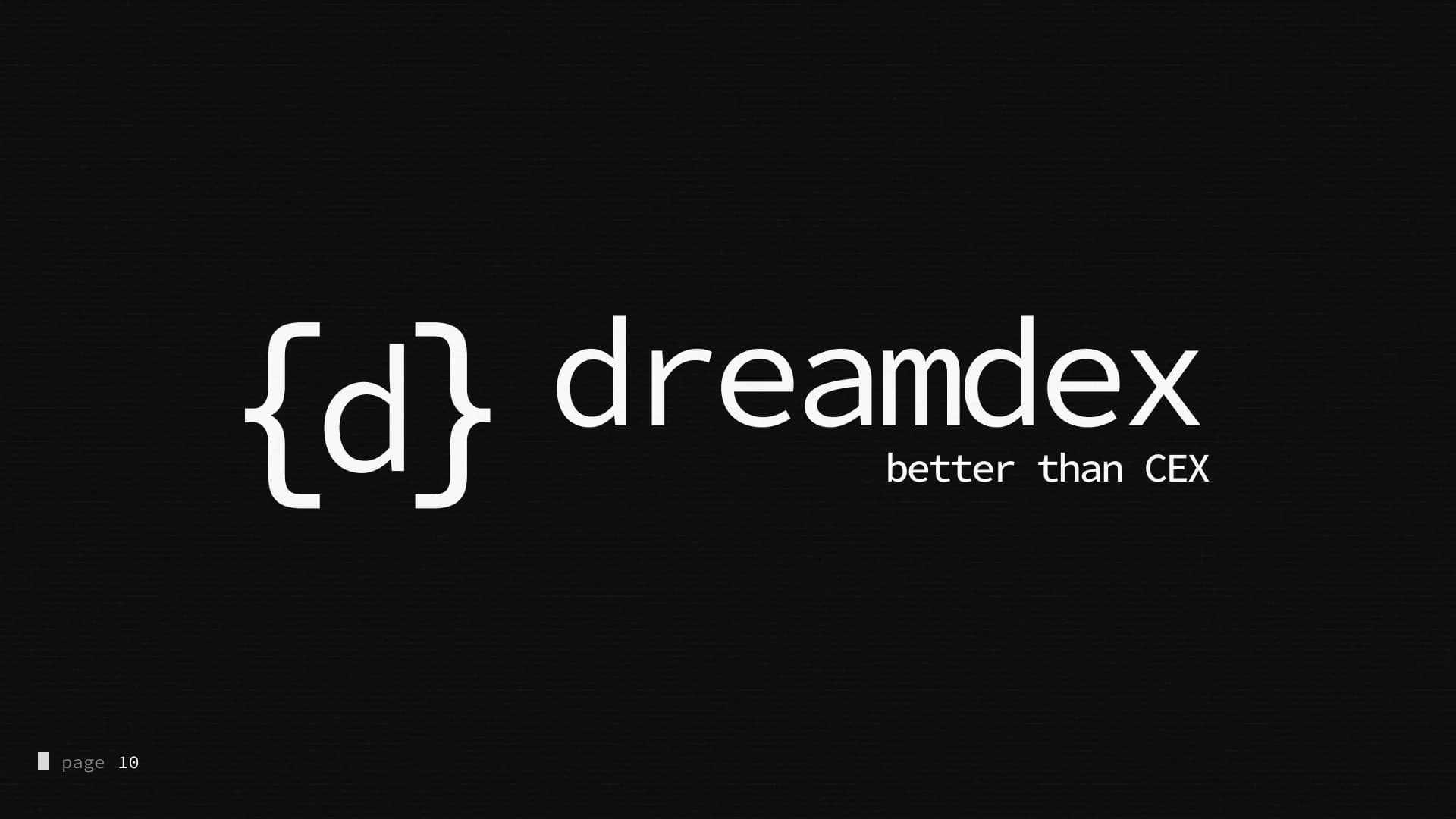
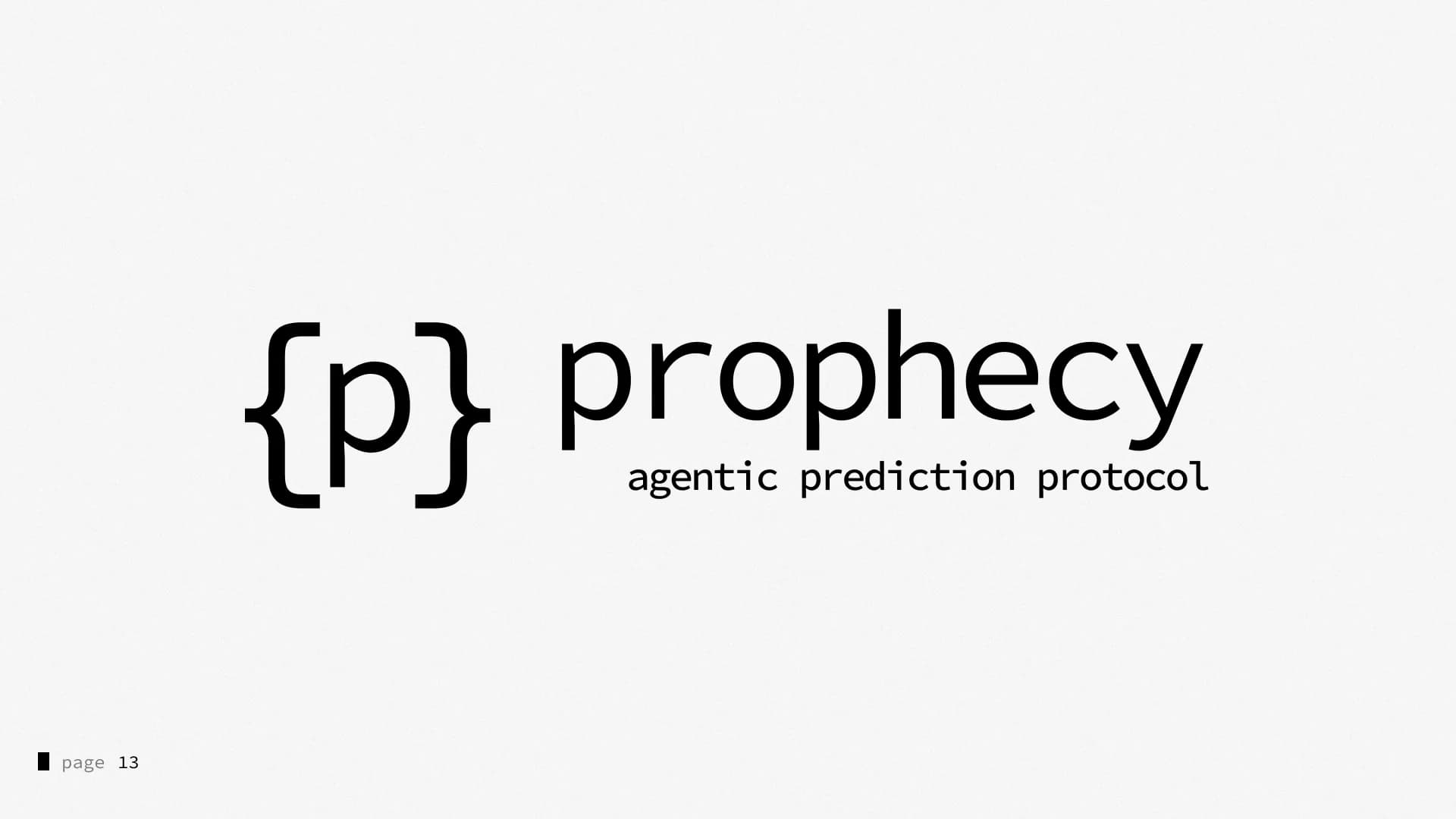
The brace system made sub-brands simple. Swap the letter, swap the accent, keep everything else. {d} dreamDEX, Better than CEX. {p} Prophecy, the agentic prediction protocol. Each carries an endorsement back to the masterbrand, from “by Somnia” to “Powered by Somnia”, so the family always reads clearly. {e}, {g}, {/}, {y}, {f} and {i} for Ecosystem, Games, Devs, Yappers, Foundation and Intern.
Every new product can join the family without a redesign.
12Visual language
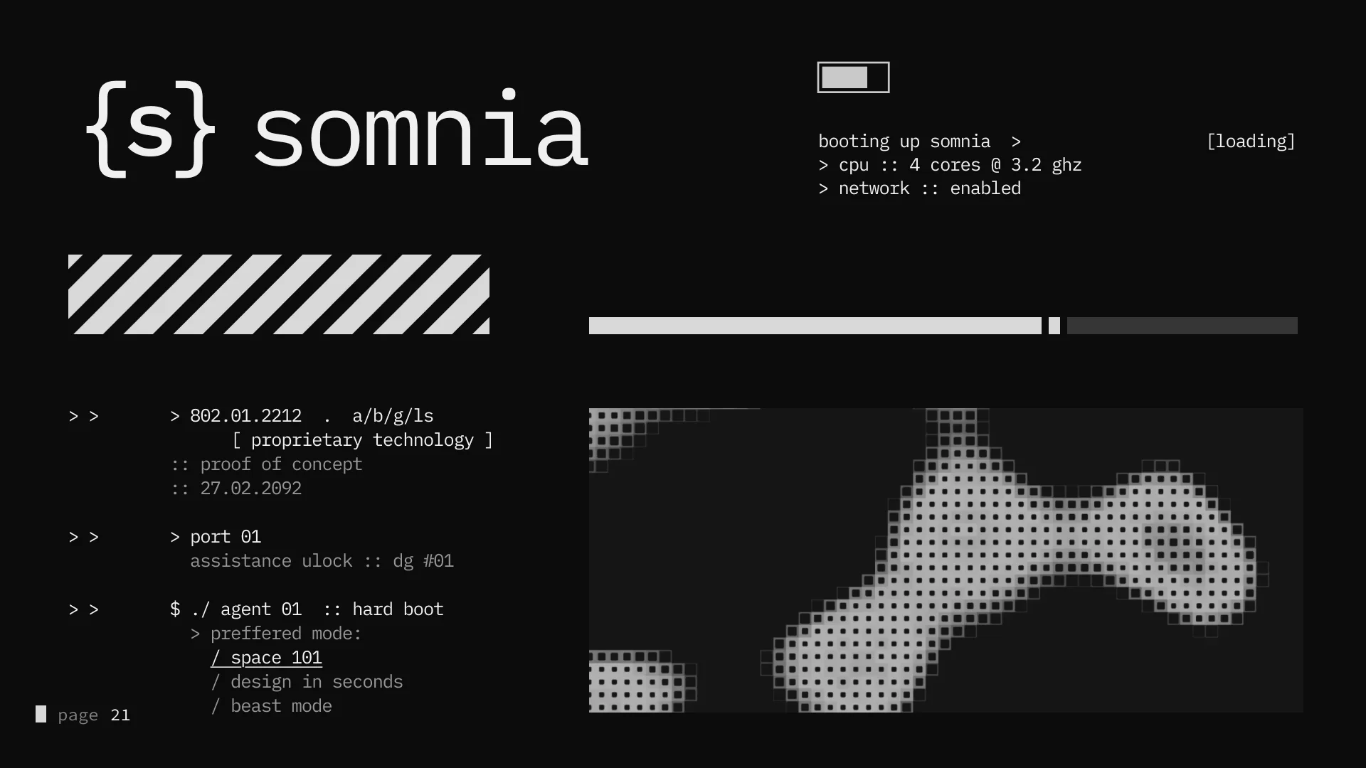
A network booting up in real time.
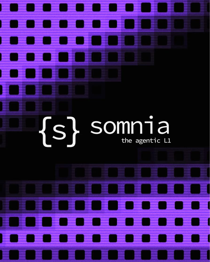
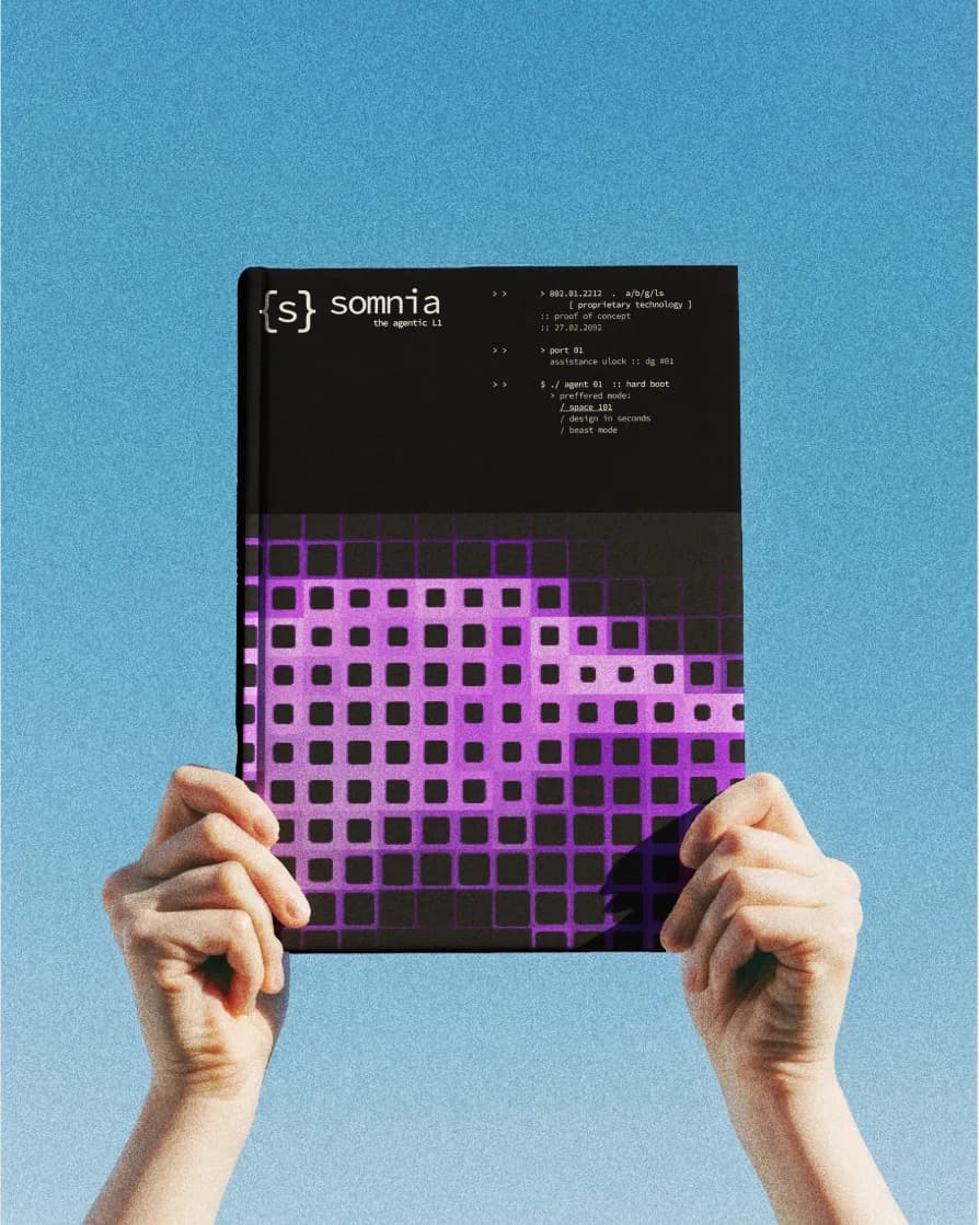
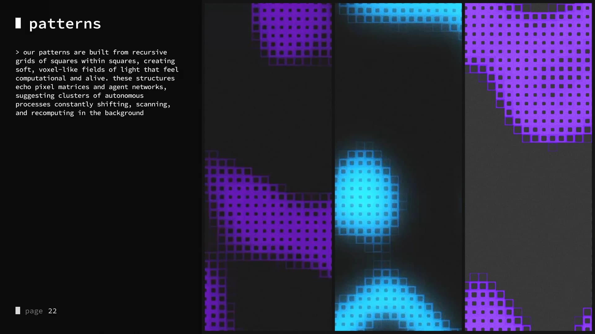
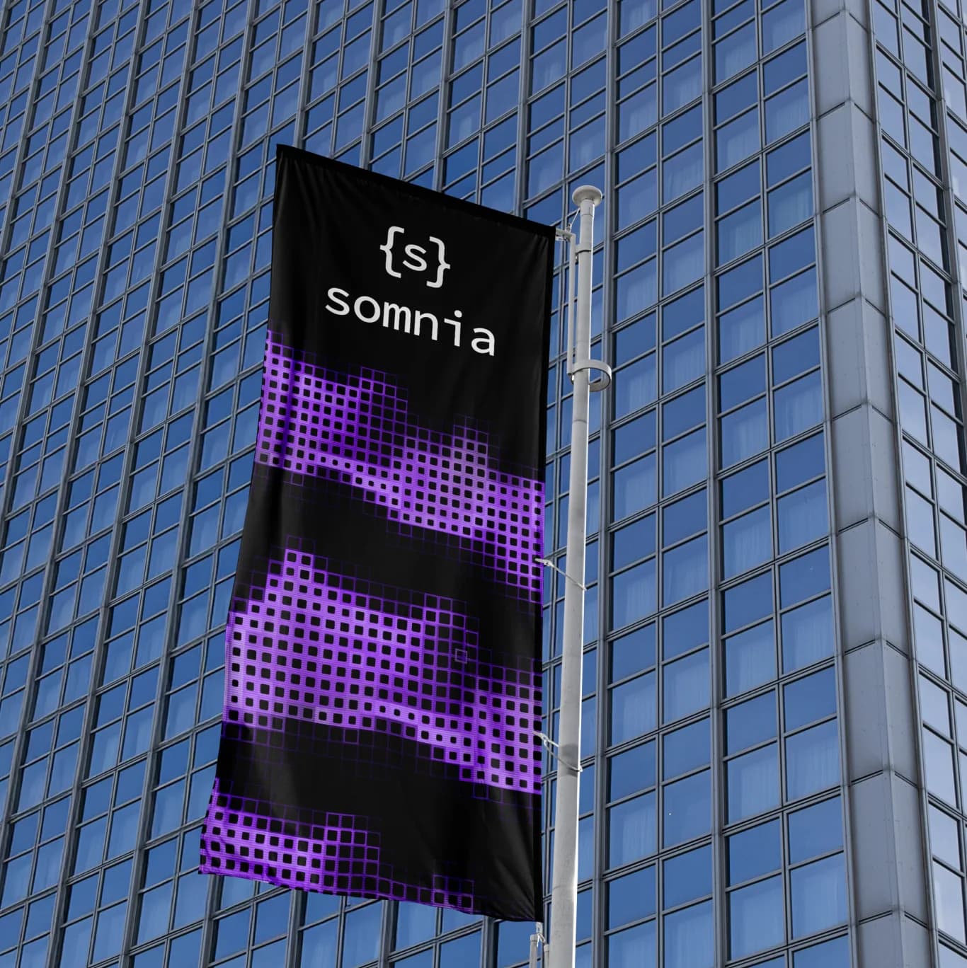
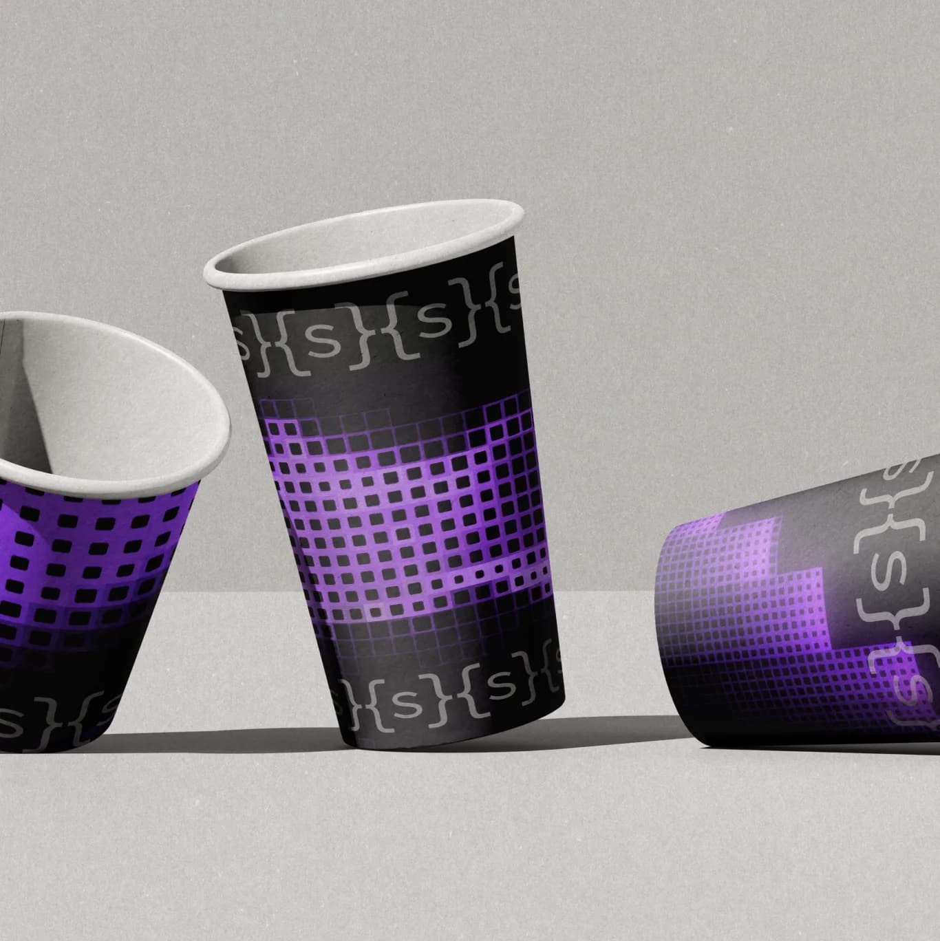
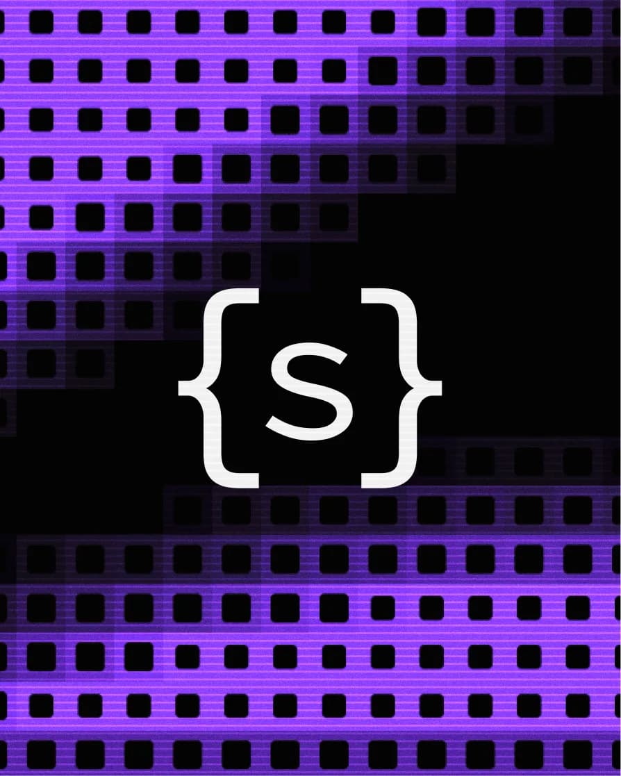
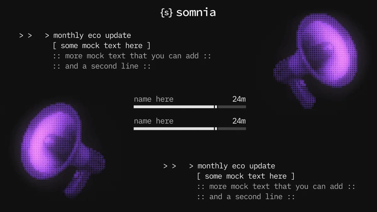
The visual language borrows from the terminal. System prompts, loading bars, pixel grids and console-style annotations. Patterns are recursive grids of squares within squares, soft voxel-like fields of light that suggest agent networks scanning and recomputing in the background.
Strict, code-like layouts meet asymmetric blocks of motion and noise. Technical, but alive.

13The retainer
Two months inside the team.
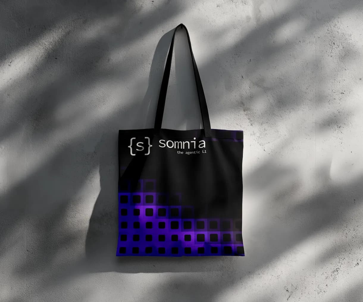
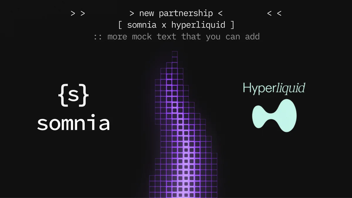
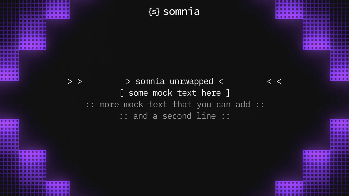
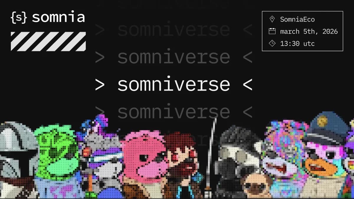
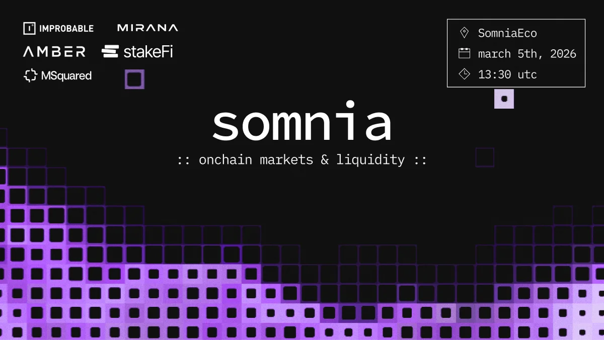
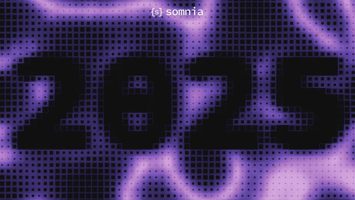
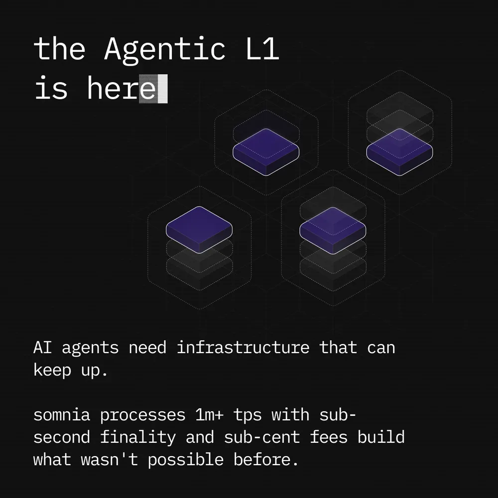
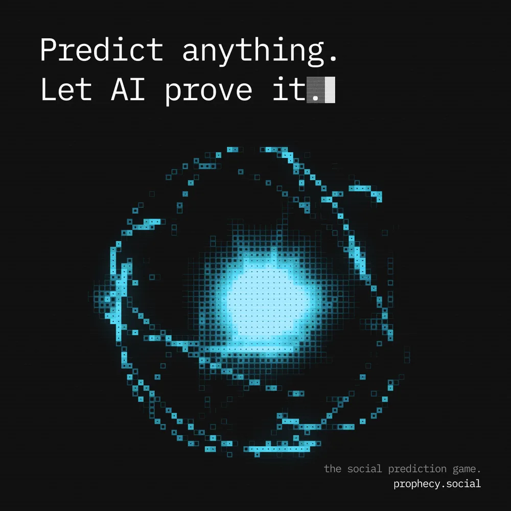
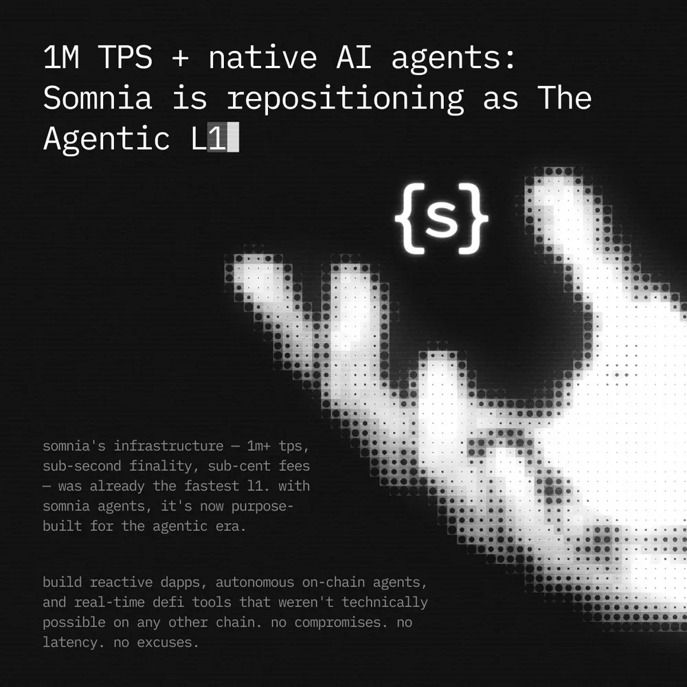
After the rebrand, we stayed on for a two-month retainer. We produced every kind of asset the team needed. Posts, banners, announcements, blog headers, profile pictures and more. Everything that shipped carried the new system.
14Website
Carrying the system onto the site.
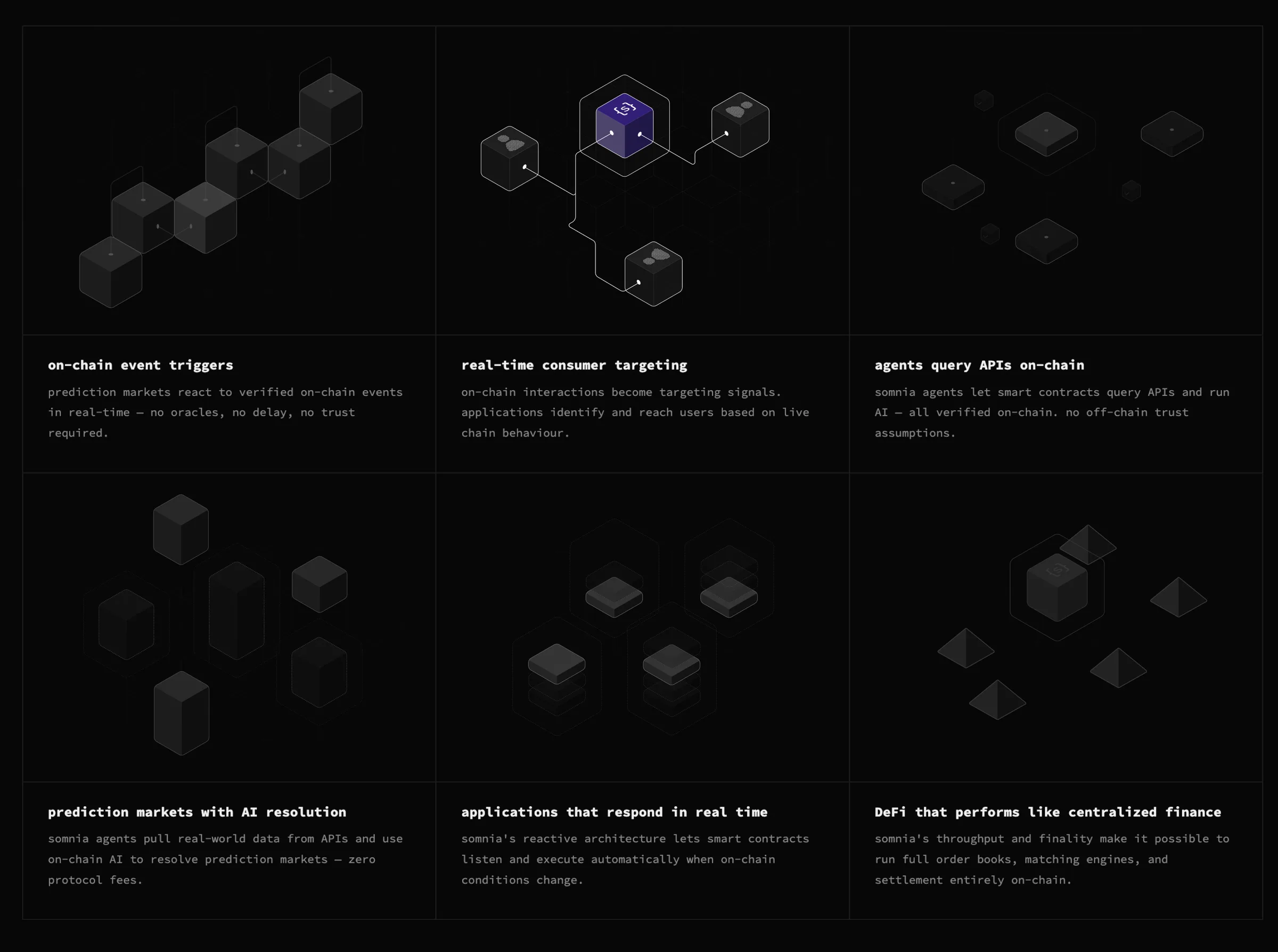
We created every illustration on the main page and ran a series of design explorations for the homepage and the Somnia Agents page. Agents were the hardest part to explain. They're consensus-validated jobs that pull APIs, scrape websites and run AI inference, with the same trust guarantees as onchain execution. The Agents page had to make that easy to follow.
The page moves from a hero video to a simple diagram of how agents work, then three feature cards (Native Reactivity, AI Inference, Deterministic LLMs), a clear path to start building and an FAQ for the deeper questions.
15The result
System
9 sub-brands
One system, ready for the next one
Identity
1 mark
Built from type, readable at any size
Partnership
2 months
Of assets and website work after launch
NextTakeover