Building a brand from zero for an agency that takes over the timeline.
Client
Services
Brand guidelines
Web design
Development
Motion
Social templates & brand assets
Description
A returning client, a brand-new agency and a brand built to fill every frame it touches.
Industry
Timeline
1 week web design
1 week development
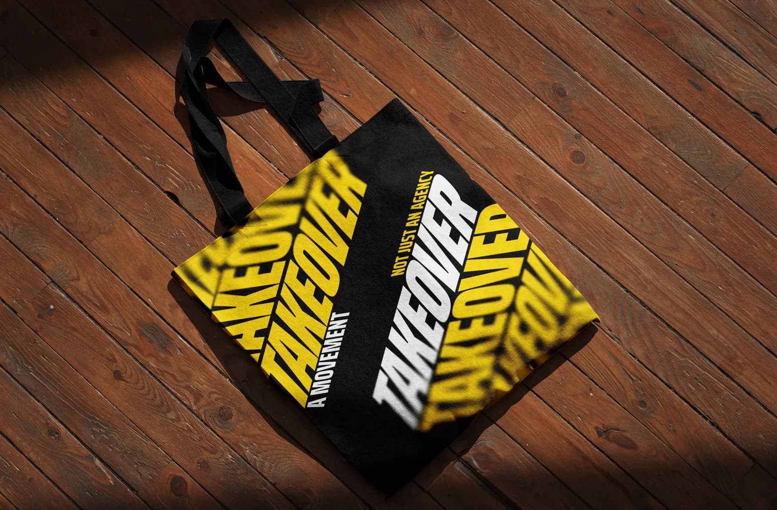
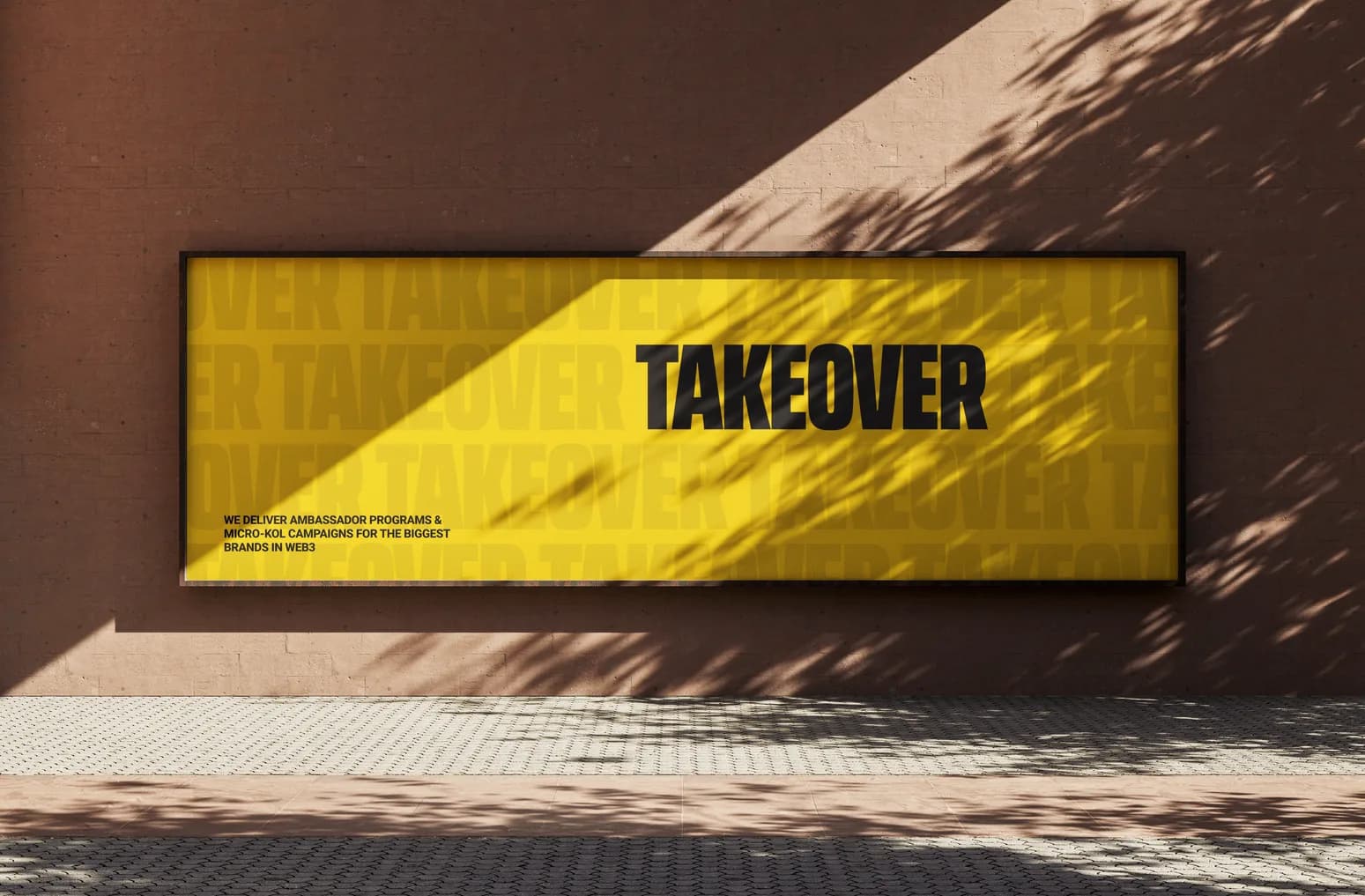
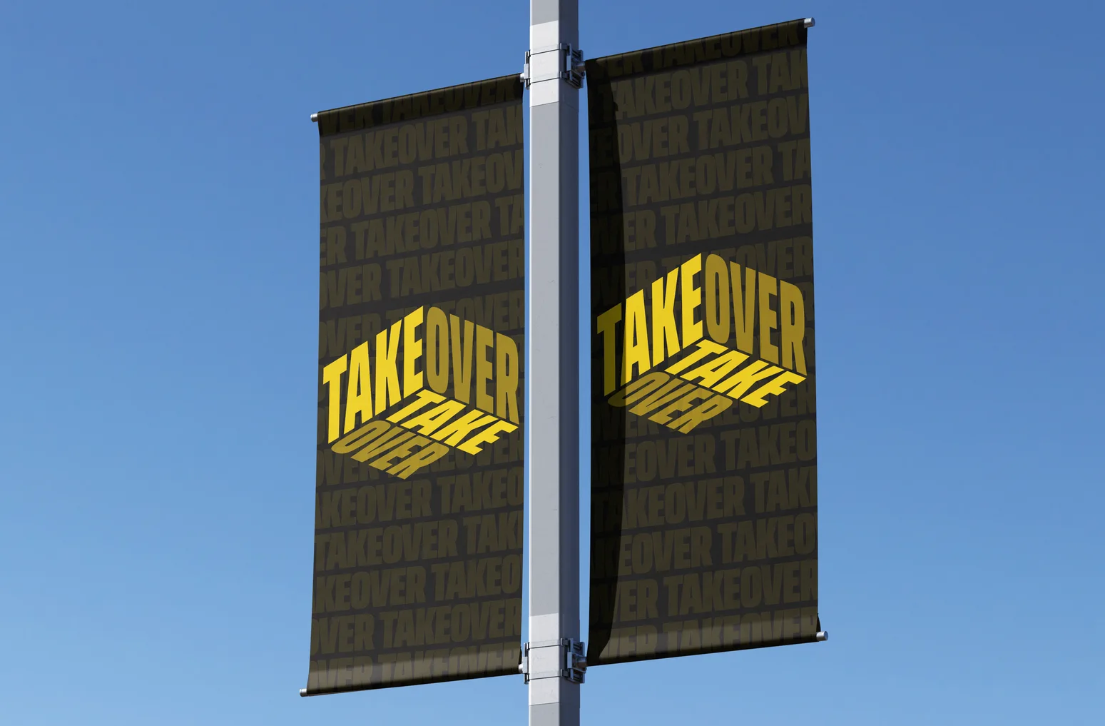
Overview
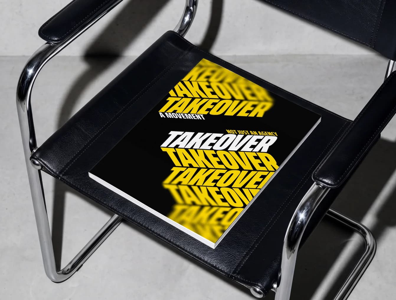
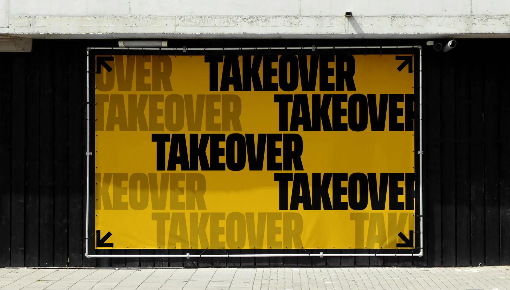
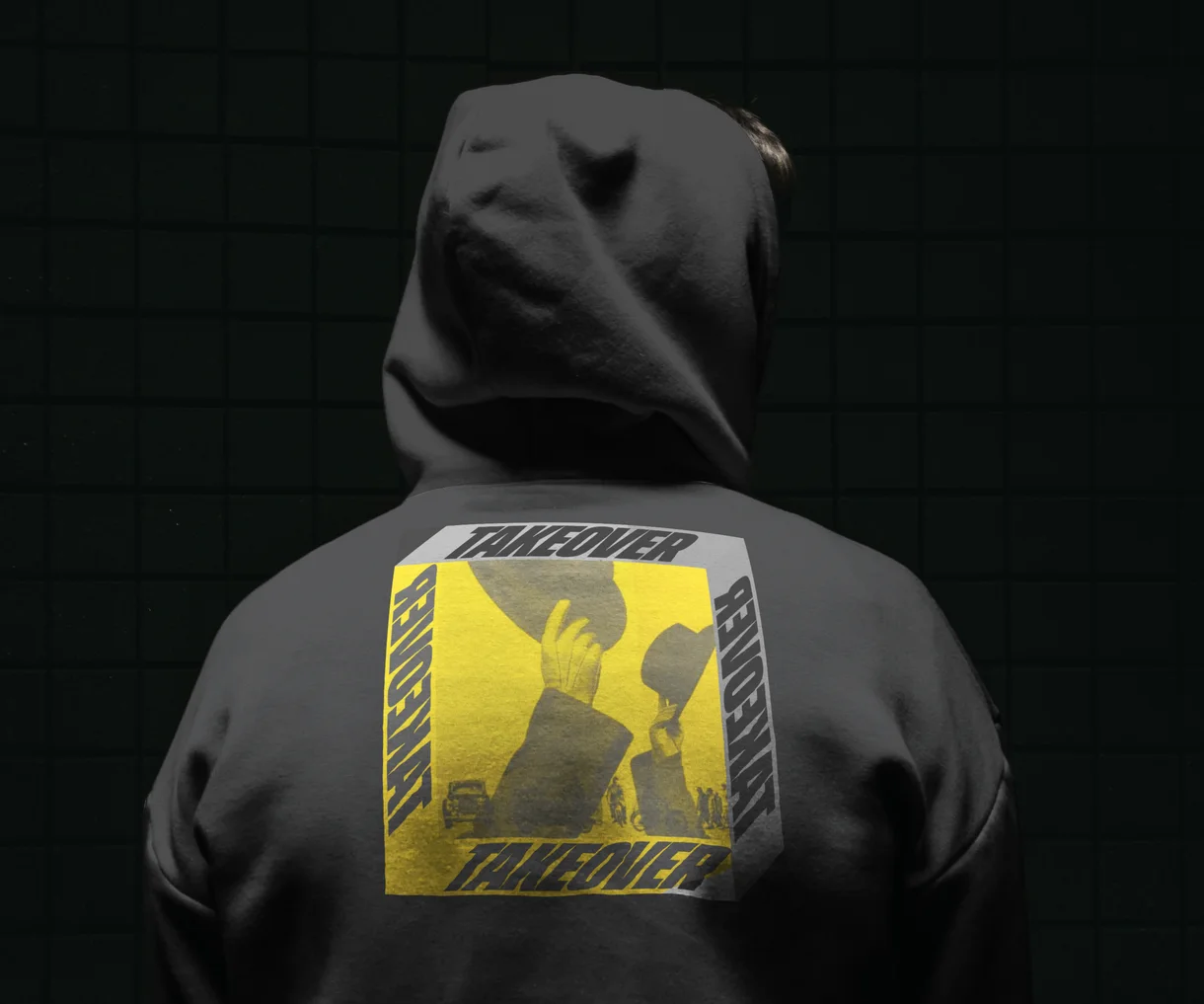
Takeover started with nothing. No name on the timeline, no brand, no site. Just a founder who wanted a movement, not an agency. After Bricktopians, Alex brought it straight to us. We built the brand from zero in yellow and black, made to fill every frame and take over the timeline.
Timeline
4 weeks
From blank page to a full brand and a live website
Exploration
8+
Logo directions explored before the final mark
Partnership
3x
Times Takeover came back for more brand assets
01About the project
It started with Bricktopians.
Alex runs Bricktopians, a 10,000-piece NFT collection with its own creator program. The project had grown, but its website was still a plain HTML page that didn't show what Bricktopians had become. We redesigned it with motion and a lot of care in the details.
Alex liked the work, and especially the animations and how much thought went into them, so when he started his next venture he came straight back to us. That venture was Takeover. A brand-new agency running micro-KOL campaigns across the biggest creator network in Web3, with no brand and no website.
02The challenge
Make a brand-new agency
feel like a movement.
Takeover runs coordinated campaigns through 300+ niche creators for Web3 and tech brands. Alex didn't want it to look like an agency at all. In his words, it's “a movement, not an agency. Closer to a cult or streetwear culture.”
A
Starting from zero
No name recognition, no visual history, no site. Everything had to be built at once.
B
Not another tech brand
No blue, no red, no pastels. Nothing that looked like gaming, tech or a typical agency.
C
A movement, not a service
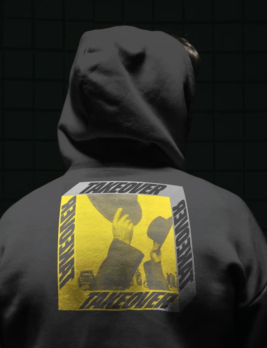
The brand had to feel propagandistic, streetwear-adjacent and a little cult-like.
D
Built to live on the timeline
Posts, overlays and campaign assets would carry the brand far more than the website.
03Brand discovery
Start with what Takeover
means to the founder.
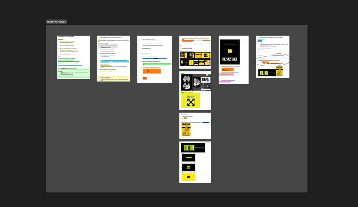
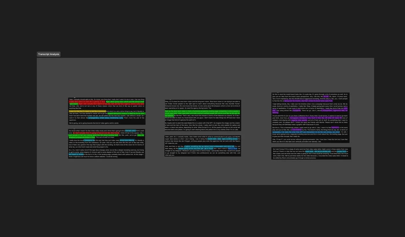
Discovery ran through our usual steps. A full brand questionnaire, then a working call with Alex. We color-coded the call transcript line by line to separate what he loved, what he hated and what the brand had to do.
The name came first. “Takeover. Because we take over the timeline.” He described the brand in three words: bold, distinct, different. His references set the tone. The high-contrast yellow and black of Kill Bill, the strong lettering of The Substance and the Obey-style propaganda poster.
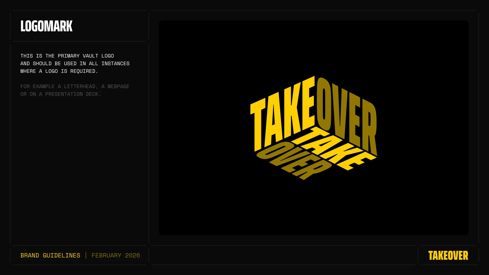
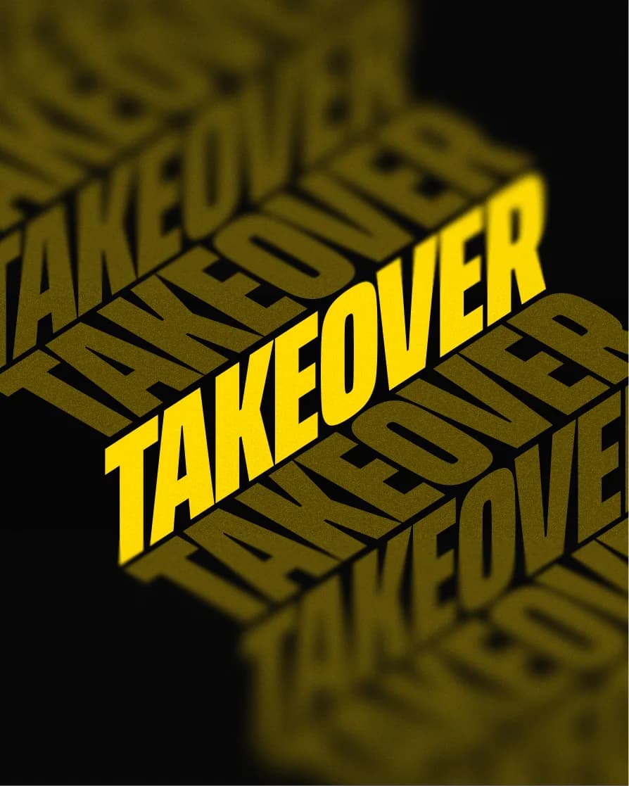
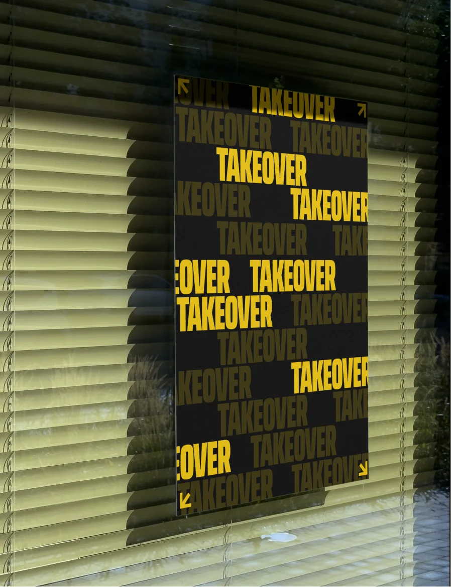
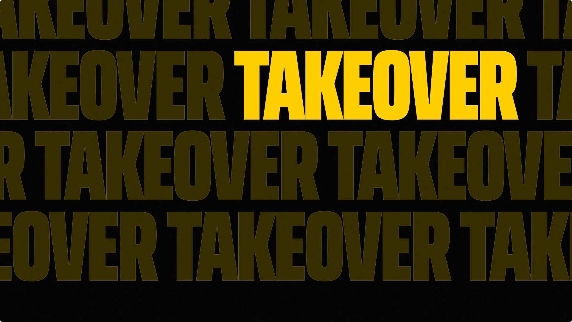
One line from the call shaped everything after it. When the brand is tiled across a screen, it should take over vertically and take over laterally.
04Moodboard
Flat, loud and impossible
to scroll past.
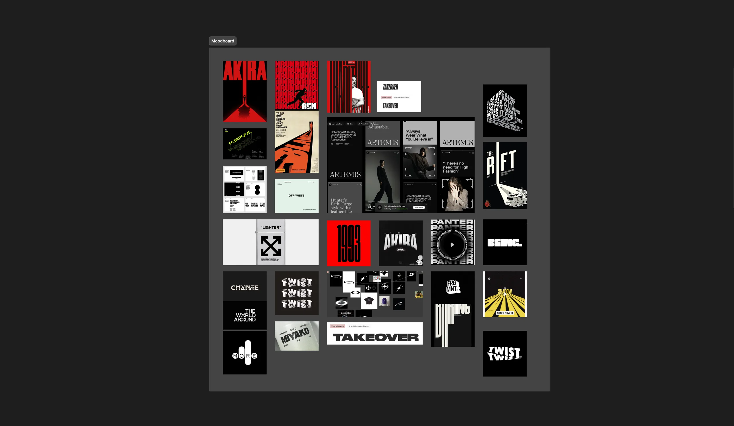
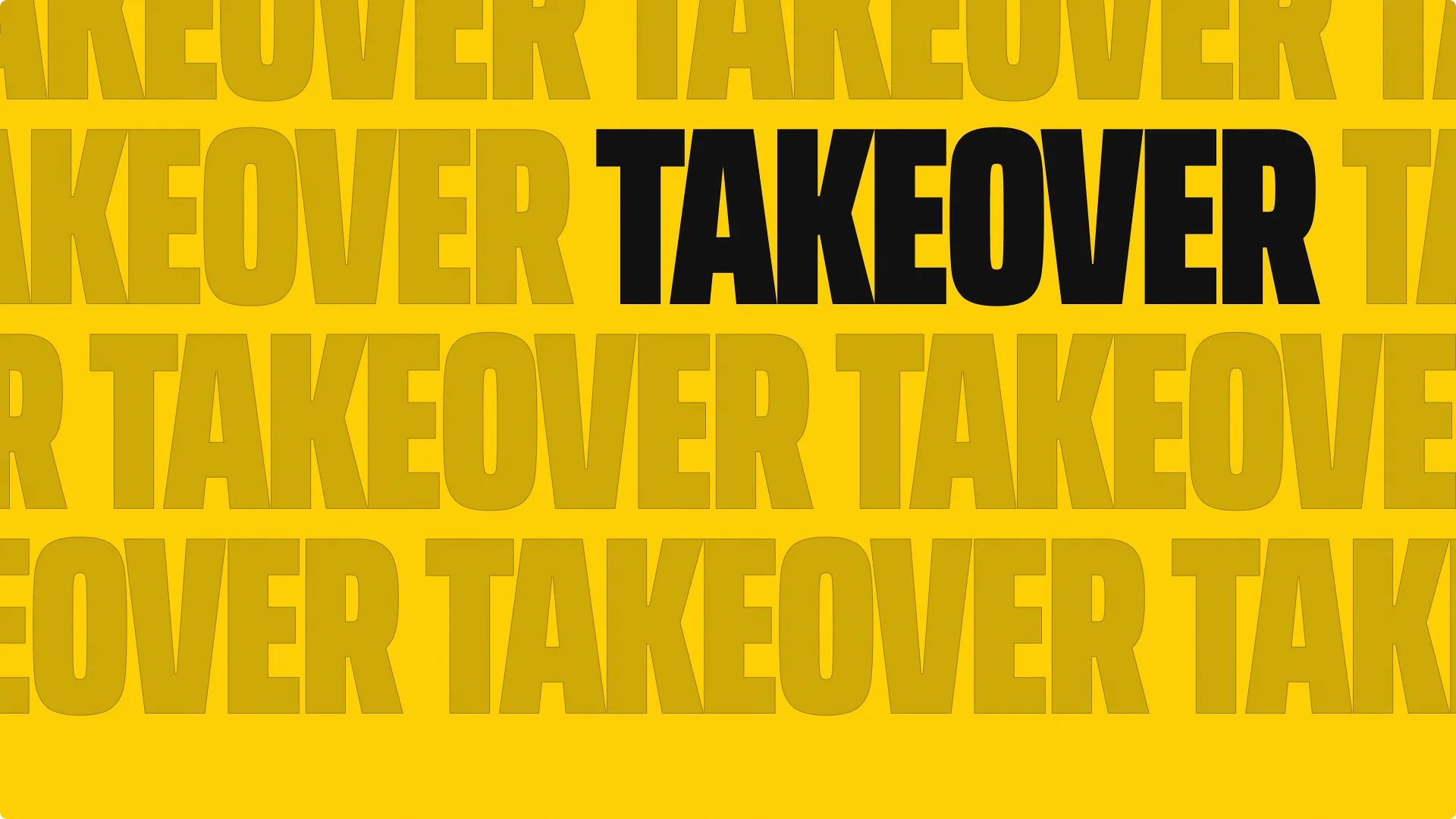
We pulled from streetwear and poster culture rather than Web3. Off-White's flat 2D iconography. Oversized, ultra-condensed lettering that runs edge to edge. Type that repeats until it fills the frame. The common thread was pressure. Every reference feels like it's pushing against the edges of its own canvas.
05Logo exploration
Eight directions on one idea.
Taking over the space.
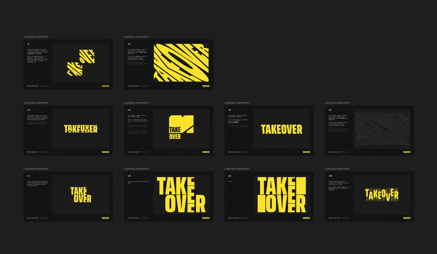
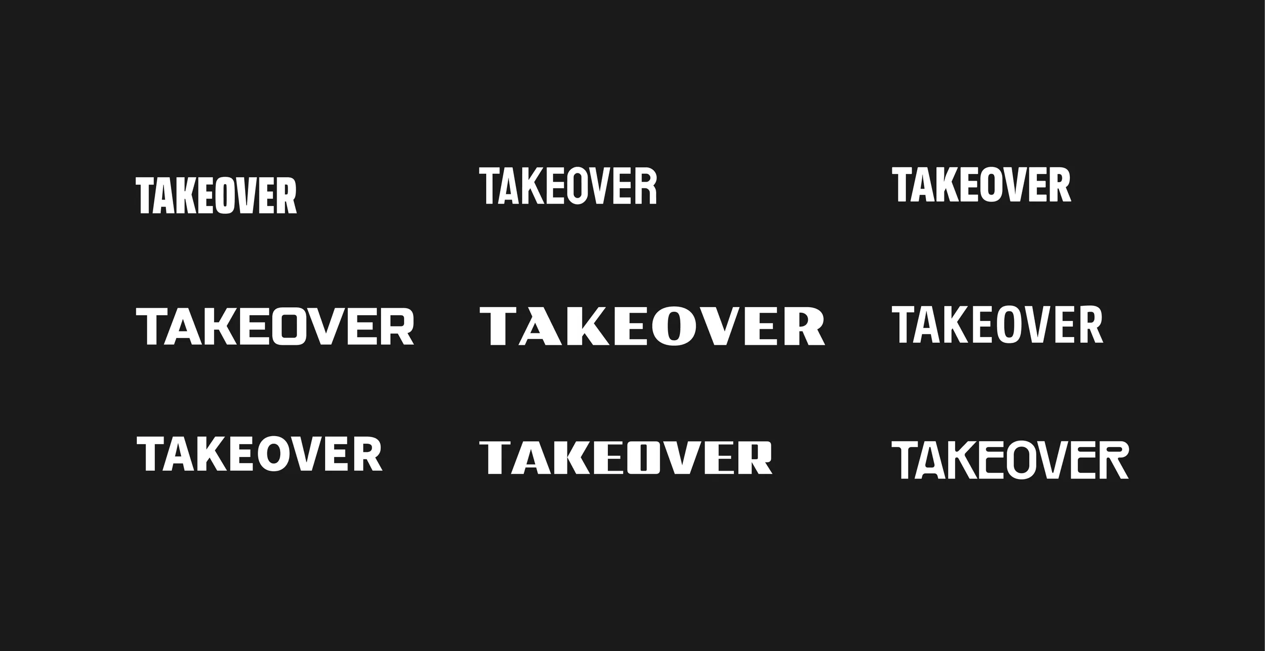
We explored the name every way we could think of. Letters stretched diagonally across the frame like a barcode. A static glitch cut through the wordmark, as if something had broken in. TAKE OVER inside a box built from a bold K. Letters overlapping and pushing each other aside. TAKE stacked on OVER, with the E taking over the gap. A ripple spreading through the letters. Two blocks of type swapping places on hover.
Each one told the story. The final round showed the strongest version was also the simplest.
06Testing the fonts
Tall, tight and built
to fill space.
The wordmark needed a typeface that could fill any space it was given. We tested Poller One, PP Rader, Staatliches, Russo One, Sarpanch and Share. Each had character, but most leaned too techy, too gaming or too wide.
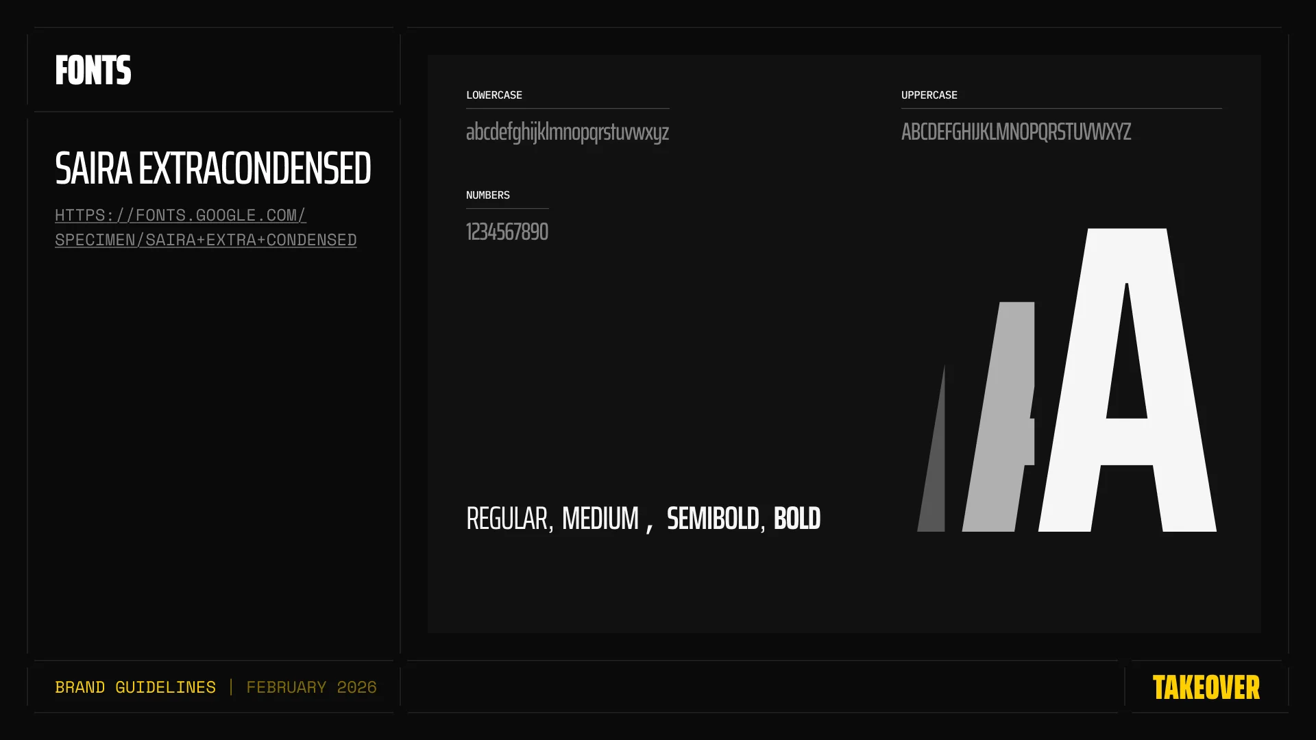
Saira ExtraCondensed won. Tall, tight letterforms that pack a lot of weight into very little width, so the name can stretch across a banner or stack inside a square and still dominate the frame.
07The final mark
The simplest answer, pushed
until it fills the box.
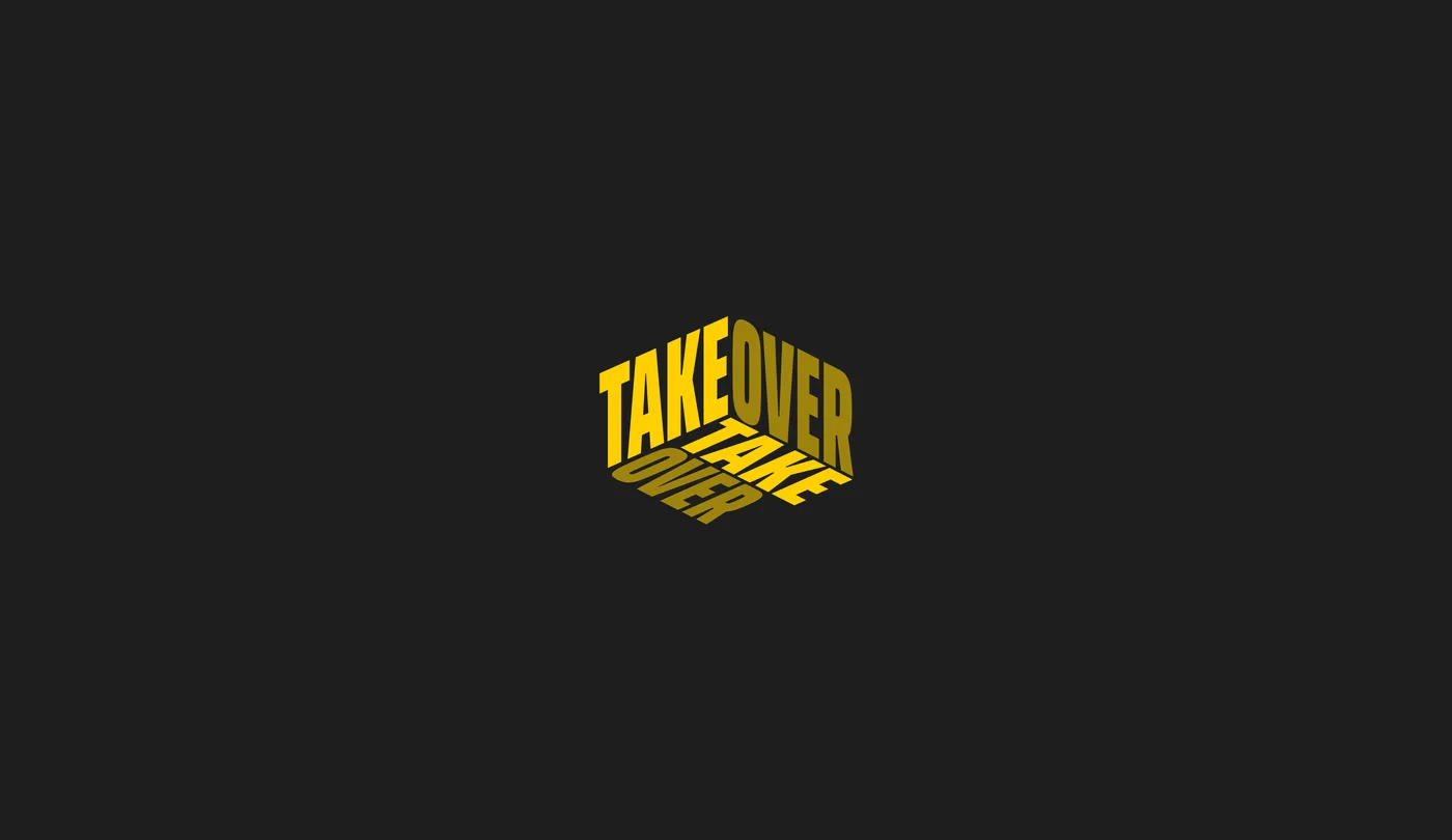
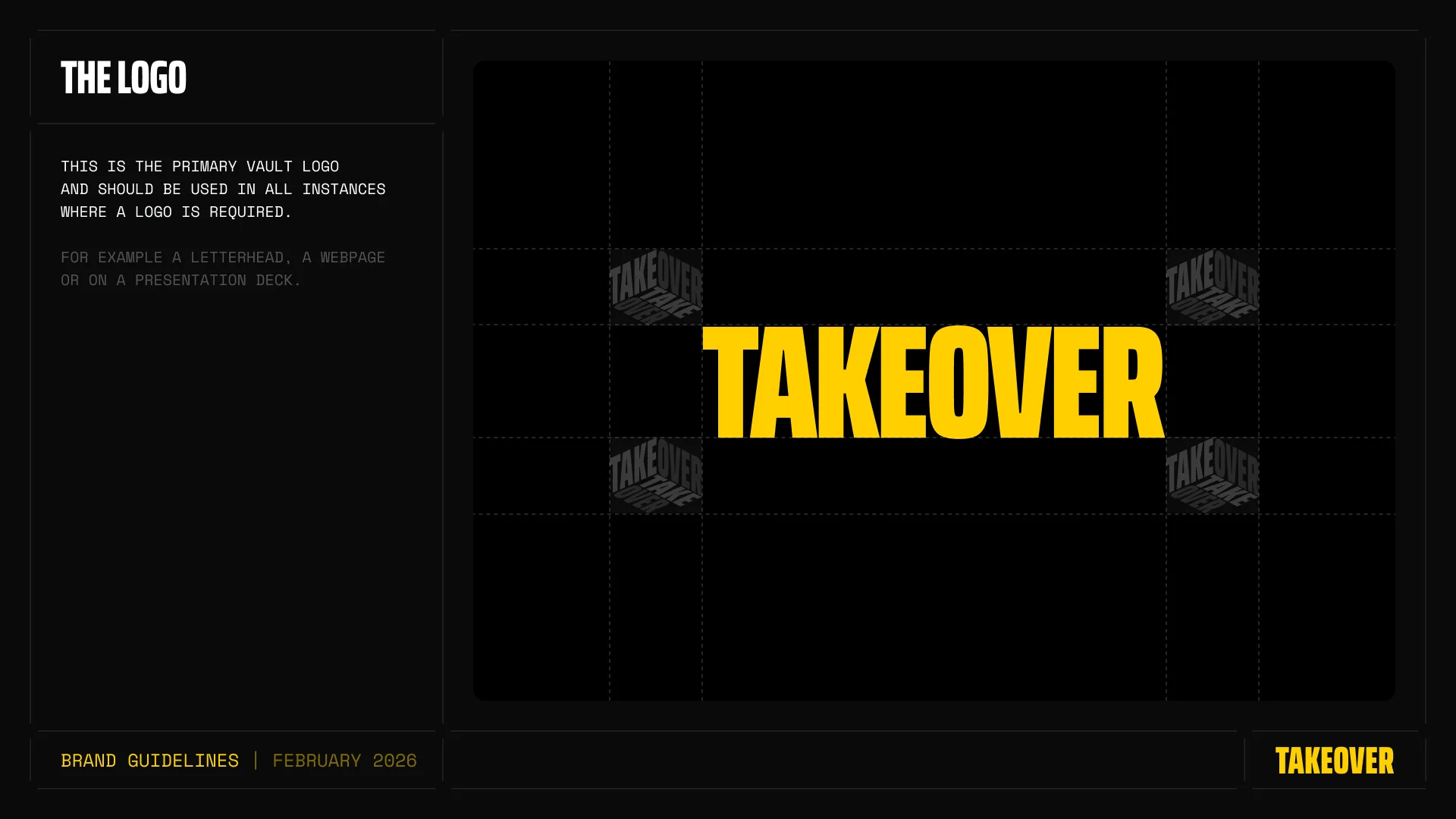
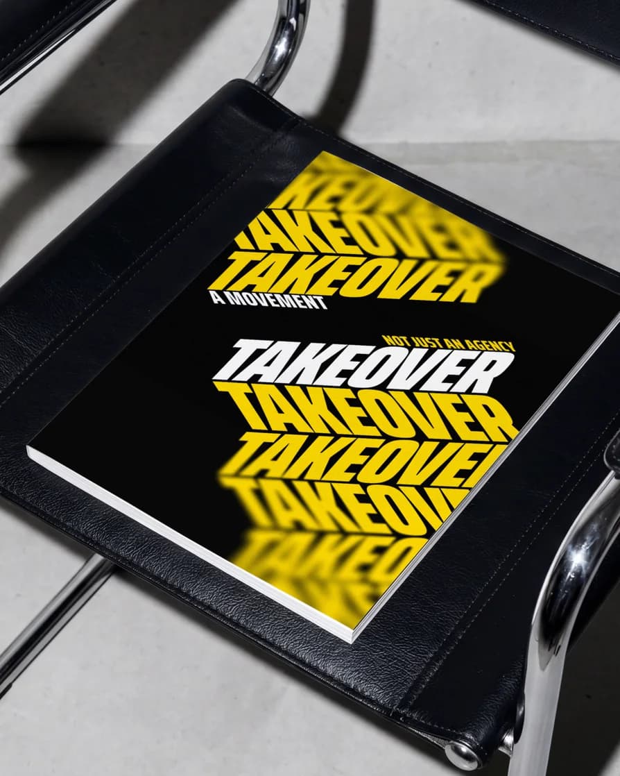
The wordmark is Saira ExtraCondensed with a few custom tweaks. Clean enough to read at a glance, heavy enough to feel loud. The logomark takes the idea one step further. The name set inside a box and filling it edge to edge, so it literally takes over the space it sits in.
08Color
Yellow and black. The
colors of a warning.
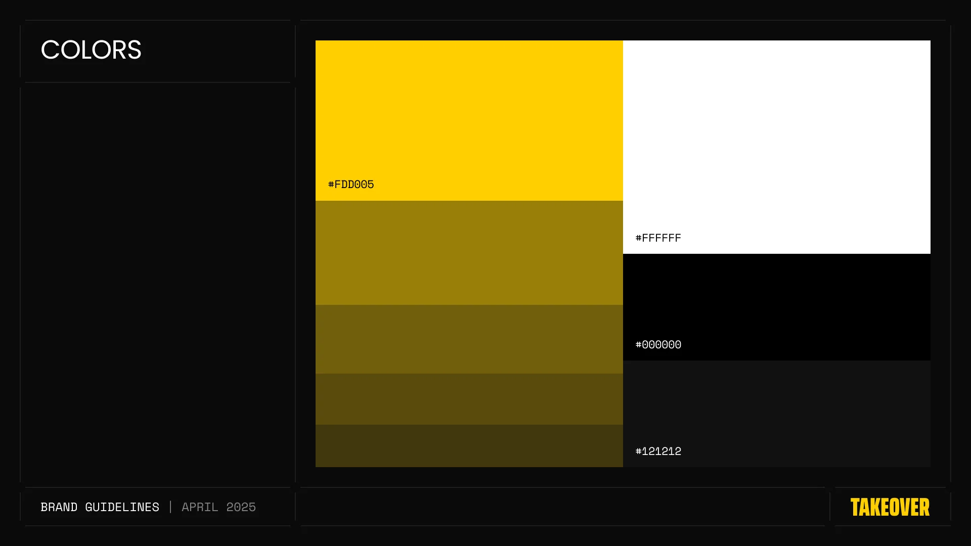
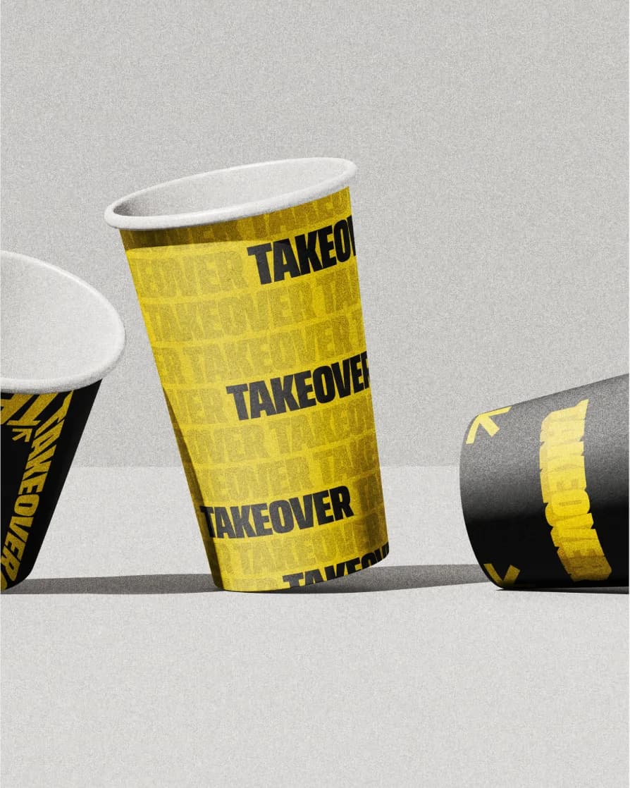
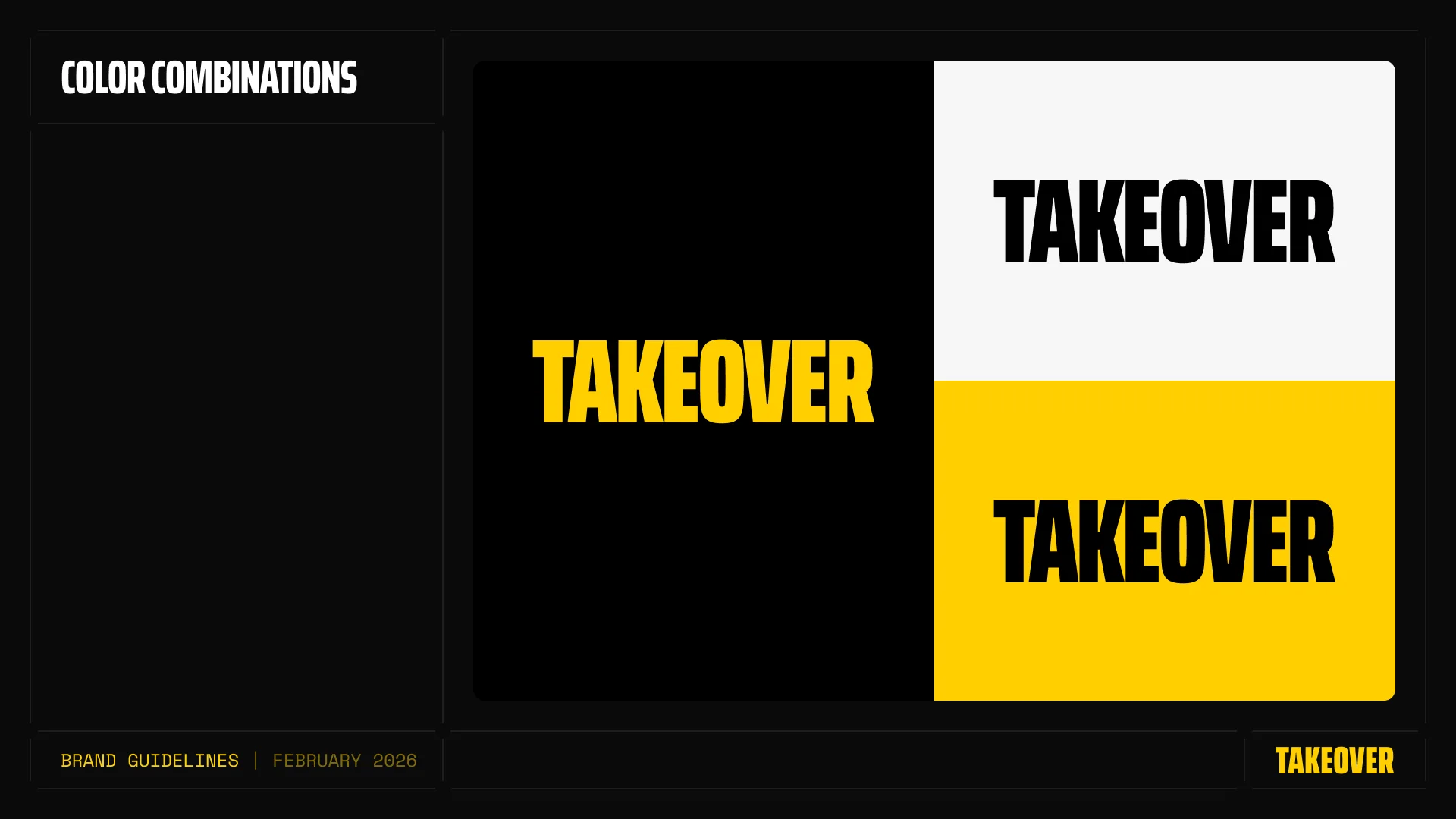
Alex asked for yellow and black from day one, and wanted to own it. We set Takeover Yellow at #FDD005, backed by pure black #000000, a soft black #121212 for surfaces and white #FFFFFF for contrast. Inverted, the two lead colors swap roles without losing any punch. Hazard-tape contrast that no one in Web3 marketing was using.
09Typography
A loud headline.
A quiet, technical voice.
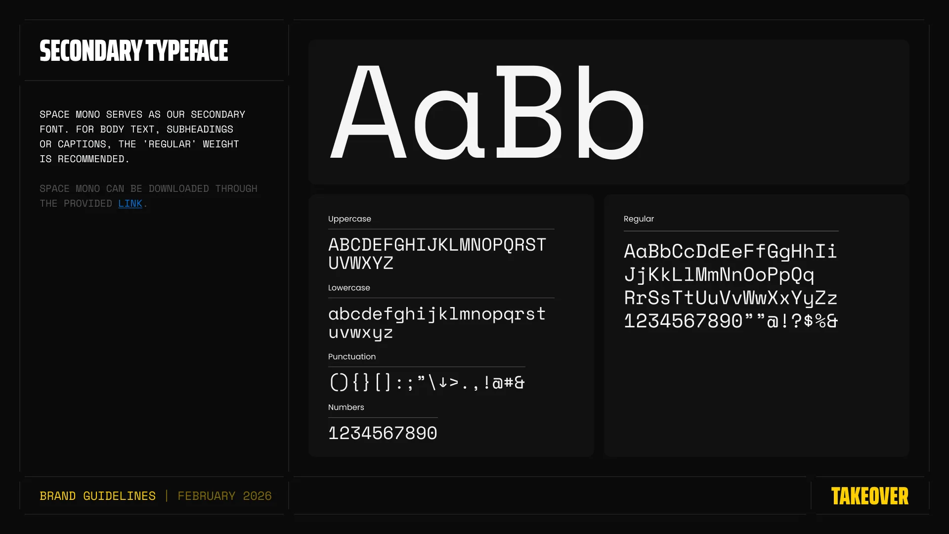
Saira ExtraCondensed carries the headlines in four weights, from Regular to Bold. Space Mono handles body text, subheadings and captions. The mono adds a precise, annotated feel next to the loud display type, like campaign notes written in the margins.
10Identity system
A brand built to be used,
not just shown.
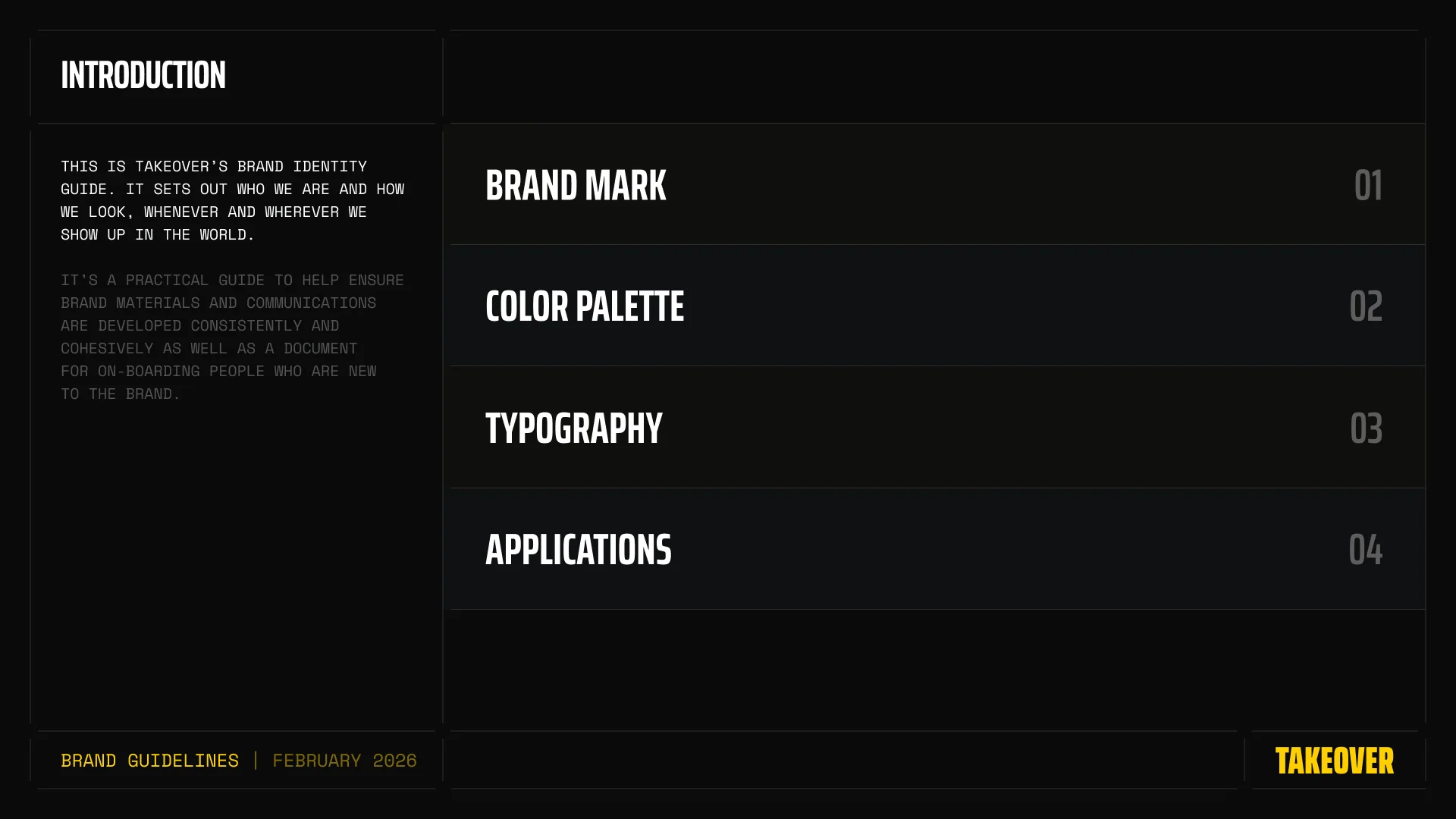
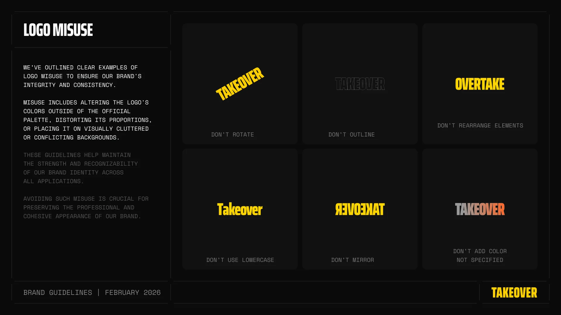
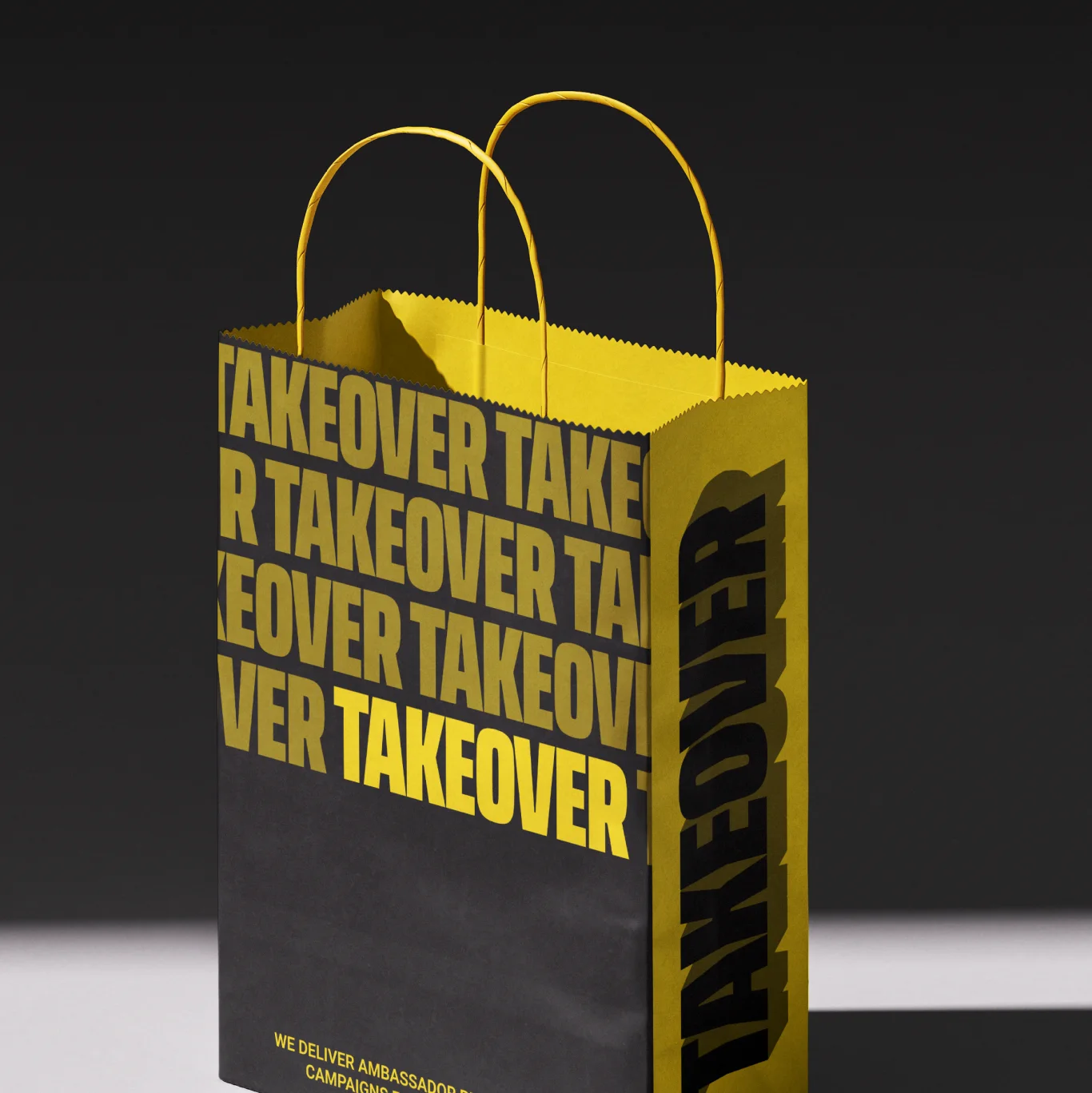
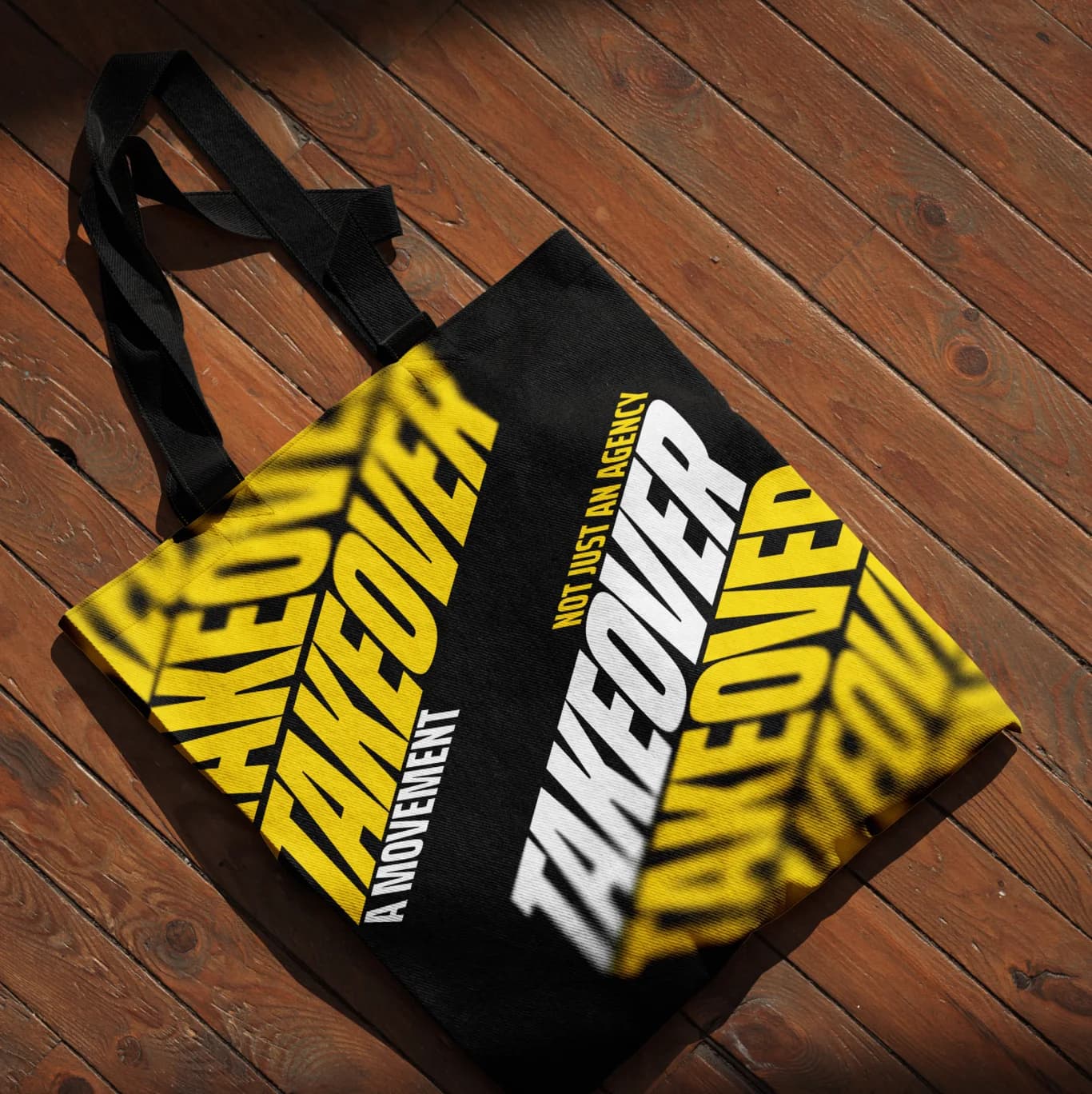
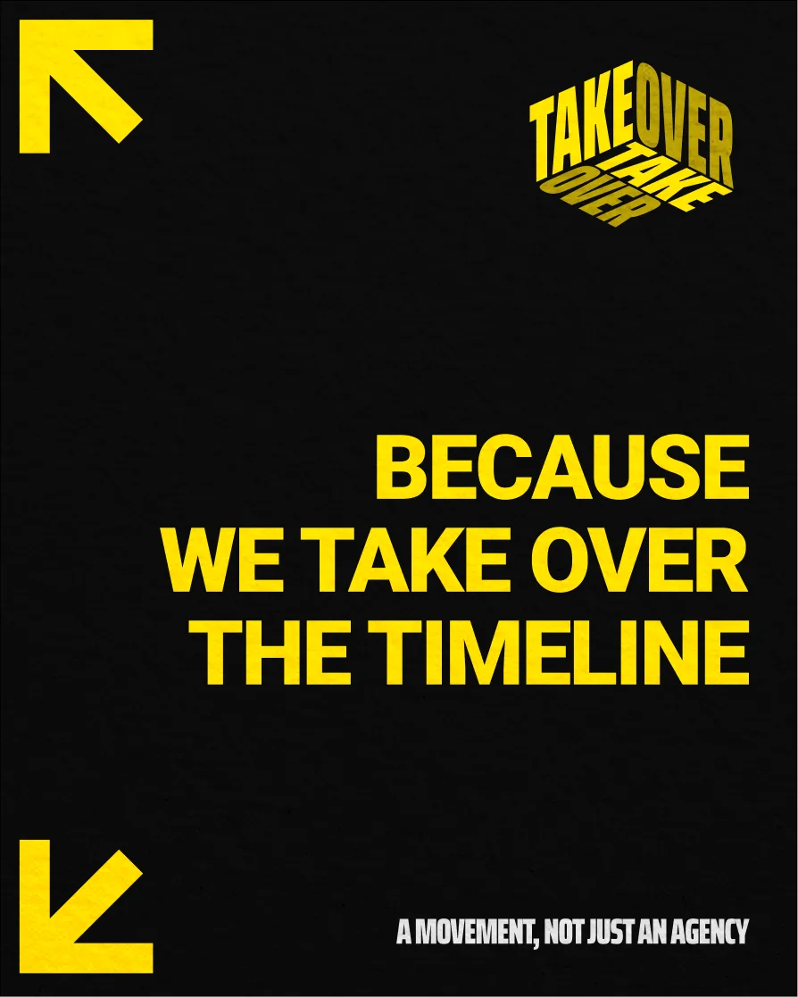
We packaged everything into a full set of brand guidelines in two weeks. Logo lockups, the logomark, color, type, layout rules and usage across every surface Takeover would touch.
11Website direction
Built to convert.
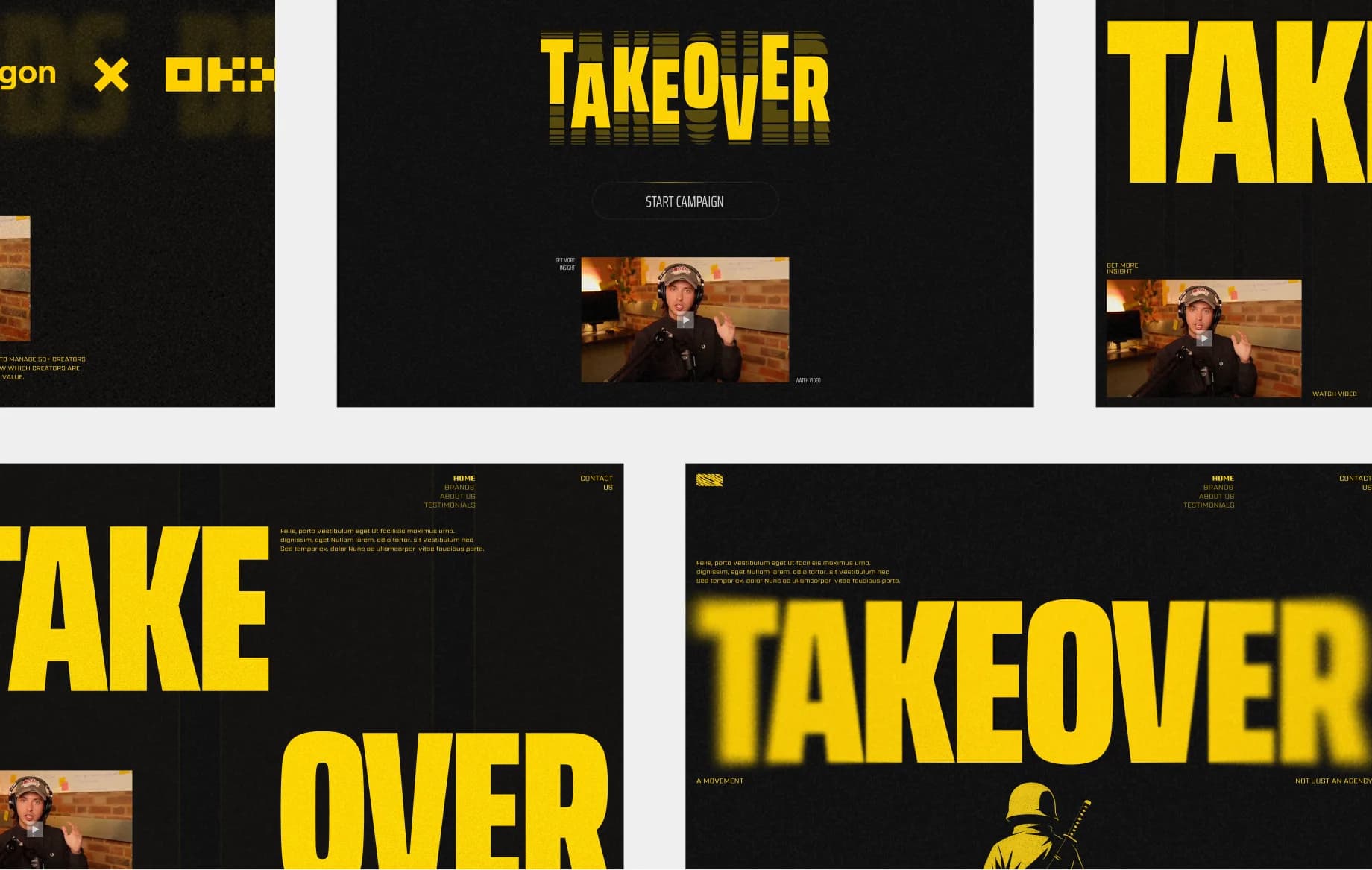
Alex's short-term goal was clear. A landing page that sends people to the video sales letter and overloads them with social proof. So the site leads with the name and one line, “We takeover the timeline for the biggest brands in tech.” Then a wall of brand logos, the two services (Blitz Campaigns and Amplification) and a straight line to Telegram.
12Final website
One week of design. One week of
development. Animations included.
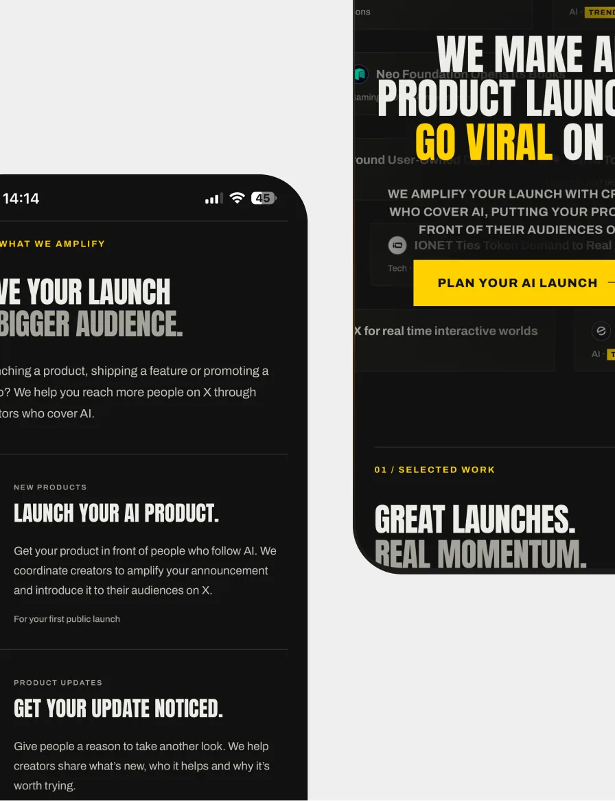
We designed the site in a week and built it in another, with motion throughout. The name repeats across the screen, trusted brands scroll past in a continuous wall and sections reveal as you move.

13They kept coming back
Three more rounds, because
they wanted more of it.
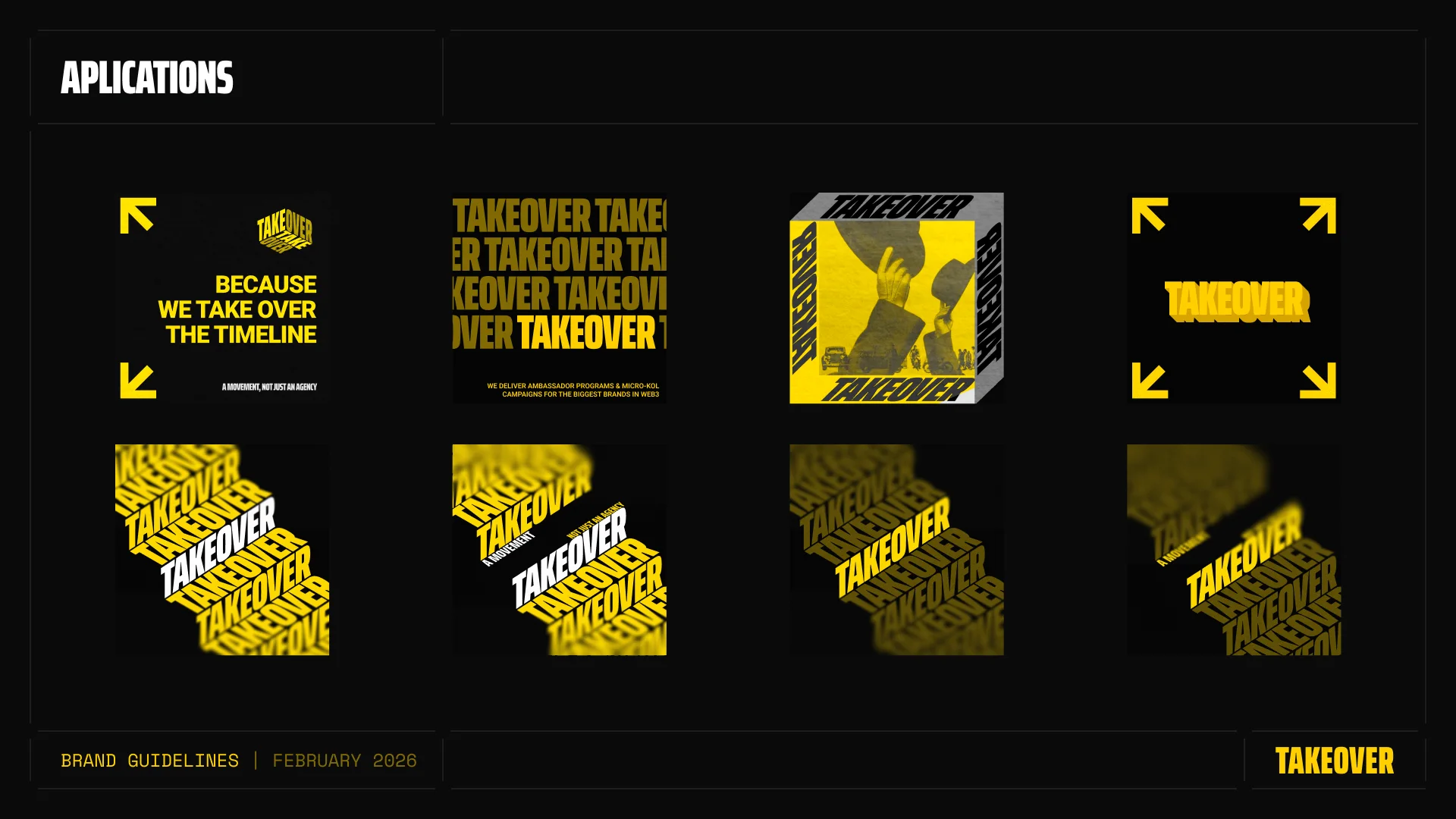
After launch, Takeover came back to us three more times. Not for fixes, but for more of the brand. Branded backgrounds, overlay logos, post templates and social assets, so every creator in the network could put Takeover on the timeline the same way.
14The result
Partnership
2 brands
For the same founder, starting with Bricktopians
Timeline
4 weeks
From zero to a full brand and a live site
Retention
3x
Return visits for more brand assets
NextV21 Studio