Repositioning a design studio for the founders it builds for.
Client
Services
Web design
Development
3D & Motion
Description
A new brand and an immersive website for the studio we've shipped 40+ projects with. V21 had outgrown its look. We rebuilt the identity around the founders and Web3 teams it designs for, then turned the site into a 3D room you explore.
Industry
Timeline
1.5 weeks web design
1 week development
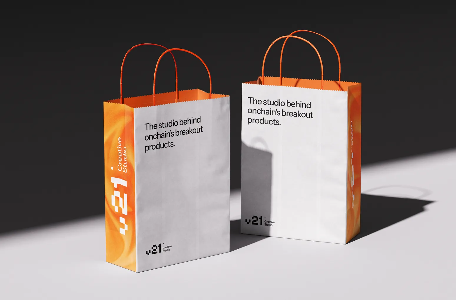
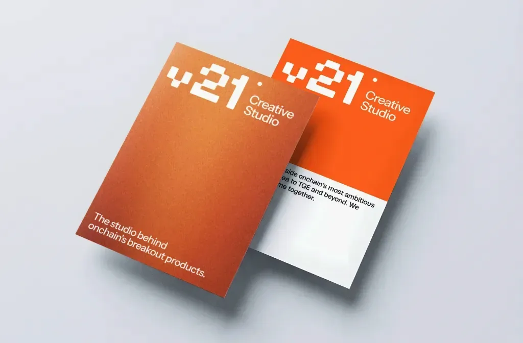
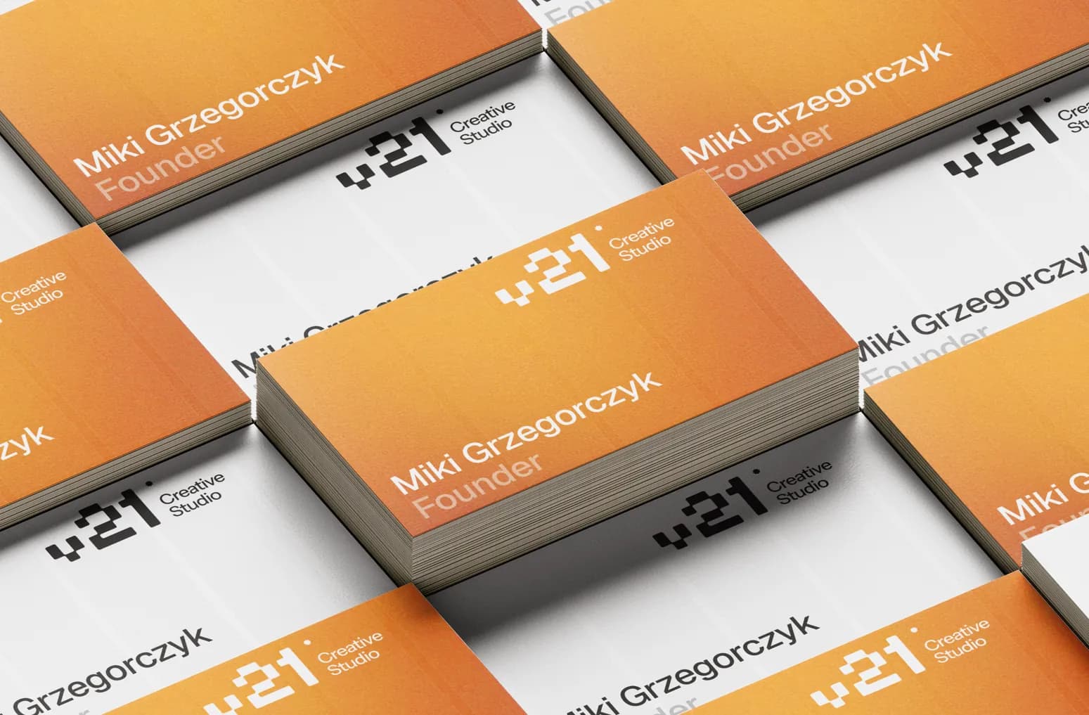
Overview
V21 spent years heads-down on client work. The studio grew. Its own brand never caught up. We came in, rebuilt it from the ground up and carried it into a website that shows how V21 works.
Partnership
40+
Projects shipped together
Client impact
$100M+
Raised by the clients we've built for together
Timeline
4.5 w
From branding to website launch
“We run our own studio and we still bring Victor in on the client work we can't afford to get wrong. He's the one person I trust with brand, website and product on the same job.”
 MikiFounder v21 Studio
01About the project
Their work had moved on.
Their brand had not.
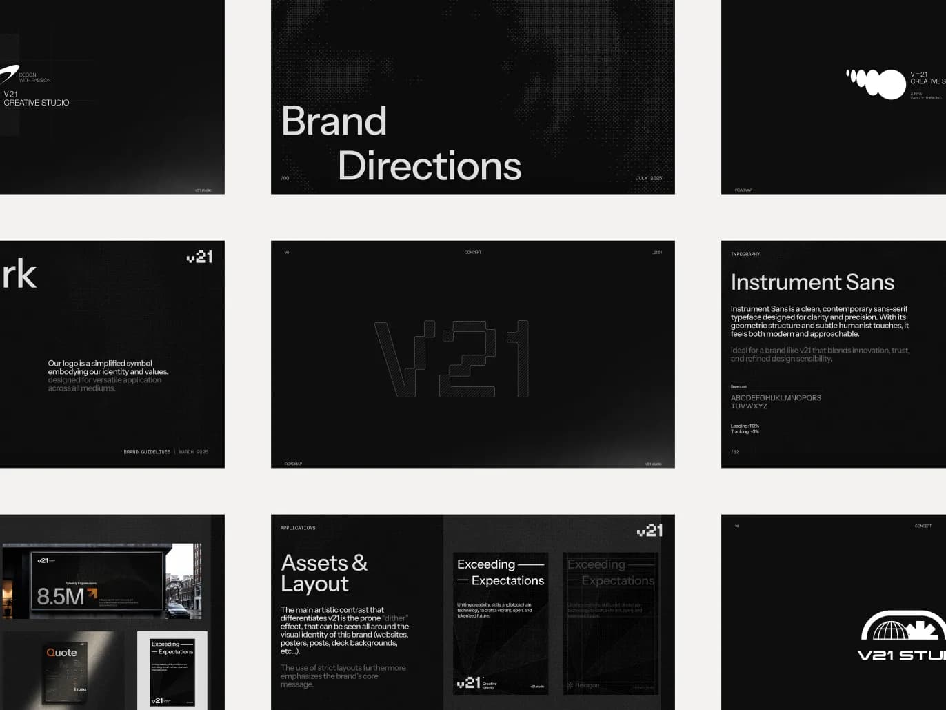
V21 designs for founders and Web3 teams. The identity described an earlier version of the studio, still embedded within the roots of web3 with no clear path forwards. That’s why after a handful of iterations, we realised that something had to be different. We couldn’t stay close to the roots. We had to find a way to evolve.
02The challenge
Stand out in a field where
every studio looks the same.
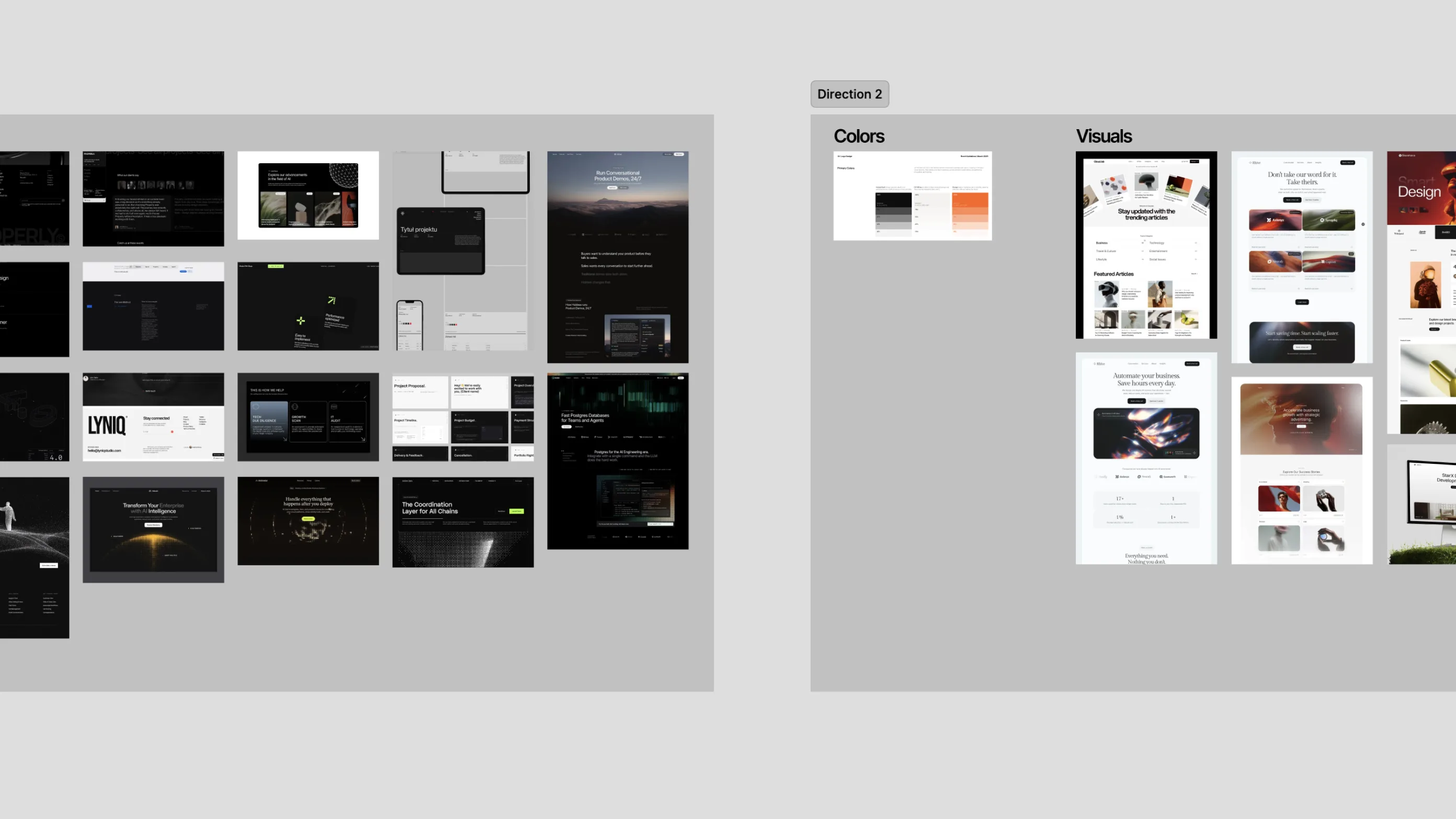
Web3 design has a uniform. Dark backgrounds, neon accents, techie and a little ominous. V21 works in that world every day, but looking like it would make them one more studio in the scroll. The brand had to feel native to founders and still break the pattern.
A
Outgrown, not broken
The studio had grown. The brand still spoke for the old one.
B
A template website
No form, no personality, nothing that said V21.
C
A dark, crowded field
Every Web3 studio leans dark and techie. V21 had to stand apart without leaving the space.
D
Designers judge designers
A studio's own brand gets read by people who do this for a living.
“We were so focused on supporting our clients and scaling the business that we didn't even have the time to think about our own website. Victor came to us with ideas that were too good to ignore.”
MikiFounder v21 Studio03Brand discovery
Show up in the light while
everyone else stays in the dark.
A few working calls with the founder, before a single pixel. An honest audit of the old brand and site, a look at how V21 sits next to the studios it competes with, then the harder questions. Who V21 works for, what those founders see every day, and what would make them stop scrolling.
04Setting the principle
The work does the wowing. The
brand stays out of the way.
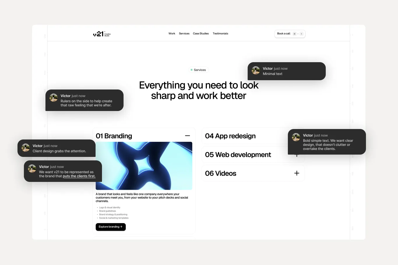
V21 exists for its clients, so the brand behaves the way the studio does. Quiet, precise, focused on the work. One rule every decision had to pass: keep the system minimal and let the client work carry the color, the imagery and the energy. One typeface. A tight palette. A light canvas.
05The search for a color
In a minimal system, the accent
does most of the talking.
With so little else on the page, one color had to carry the brand. Blue read as safe and corporate. Purple sat too close to the Web3 brands V21 designs for. Neither gave V21 a voice of its own.

Built to Be Trusted From the First Click
Complex products live or die on clarity. We design interfaces and brands that make difficult ideas feel simple, credible, and ready for the people who’ll rely on them.
Make the Future Make Sense to Everyone
Big ideas don’t sell themselves. We turn dense technology into brands people understand at a glance and products they actually want to use.
Design for What’s Next, Not What’s Now
V21 partners with ambitious teams building ahead of the curve. We shape the brands, products, and launches that help them get there first.
06Testing the orange
Orange brought the light the
brand was missing.
Orange feels like the sun. Warm, lively, hopeful. On an off-white canvas it lifts the page, and next to the dark Web3 field it stands out on sight. Put in context next to blue and purple, it was the only one that felt like V21.
Intense Dark brings balance, depth, and professionalism, adding a sense of and authority.
R: 13 G: 13 B: 13
Off-White provides a clean, neutral background that ensures readability and clarity.
R: 243 G: 242 B: 240
Orange injects freshness, and creativity, drawing attention without feeling too harsh.
R: 255 G: 99 B: 27
07Testing the fonts
One typeface, everywhere.
One font for headlines and body, so nothing breaks the pattern and nothing competes with the work. We tested Geist against Instrument Sans, Mono fonts, even serifs. Geist won. It holds up at display sizes, stays clear at small ones, and runs nine weights from Thin to Black, and more importantly, it’s cohesive with the theme we’re trying to convey: letting the work shine.
Headline & Body
Vercel · Google Fonts
Aa
Geist
- Thin100Aa
- Extra Light200Aa
- Light300Aa
- Regular400Aa
- Medium500Aa
- SemiBold600Aa
- Bold700Aa
- ExtraBold800Aa
- Black900Aa
Increase revenue from the users you already have — by redesigning your product’s UI & UX
Increase revenue from the users you already have — by redesigning your product’s UI & UX
Increase revenue from the users you already have — by redesigning your product’s UI & UX
Increase revenue from the users you already have — by redesigning your product’s UI & UX
08Identity system
A full toolkit, built to flex
across every surface.
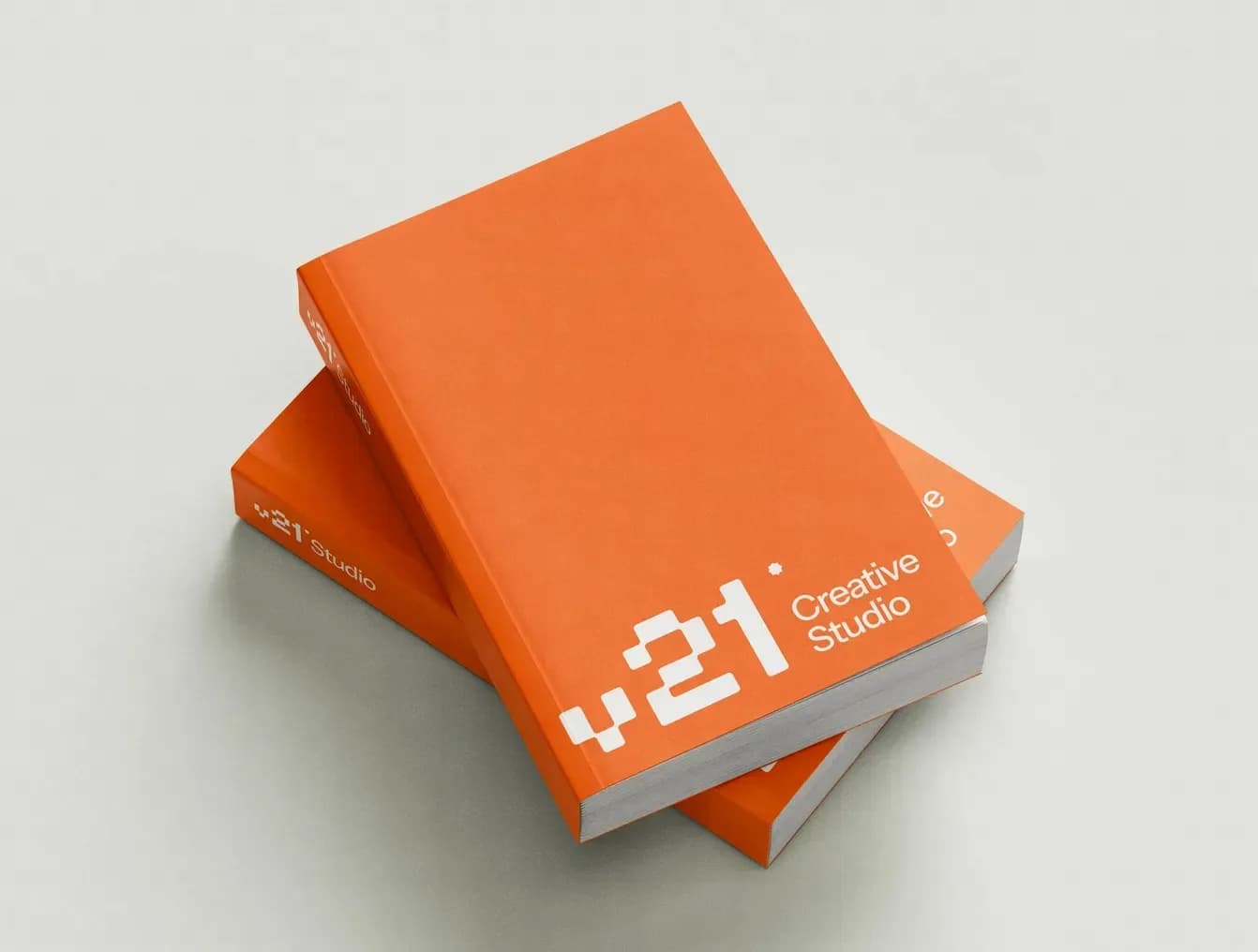
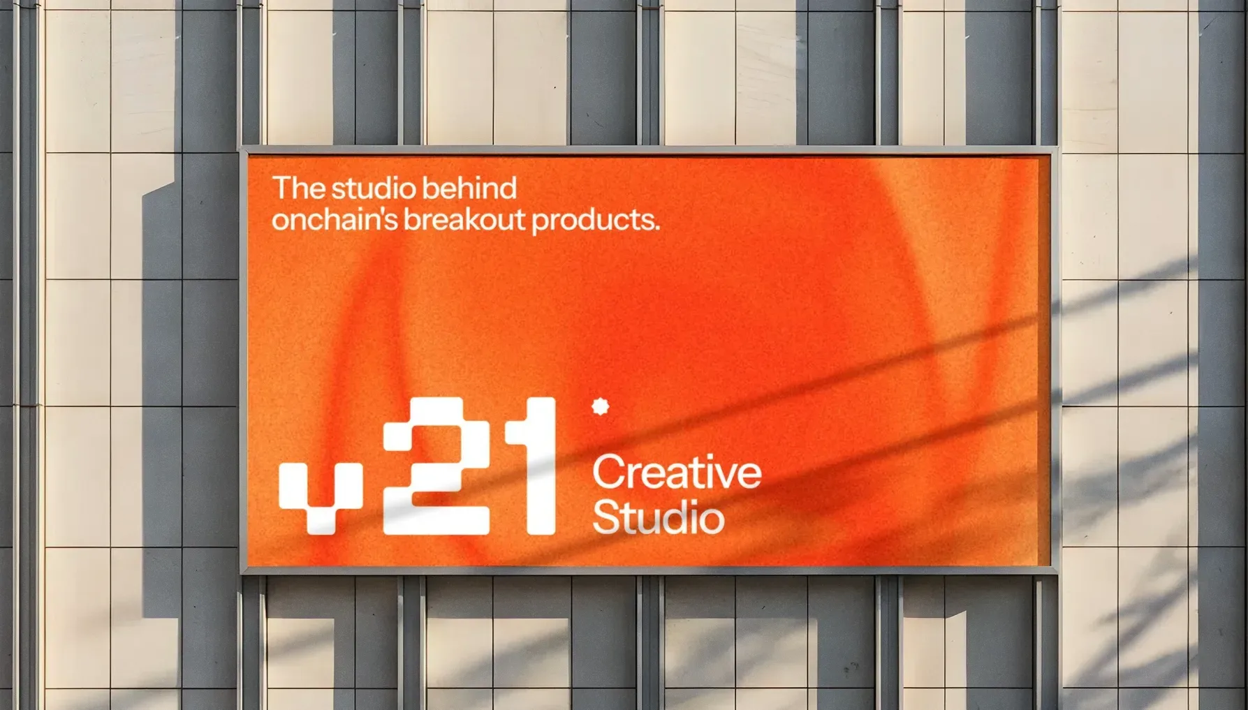
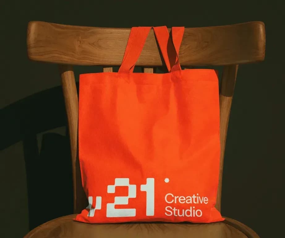
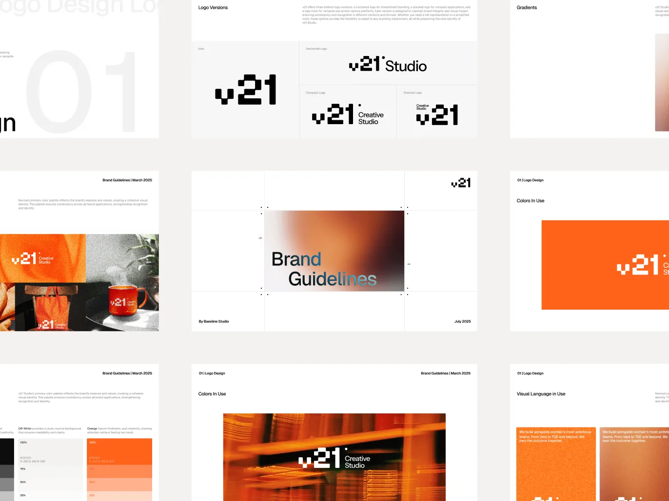
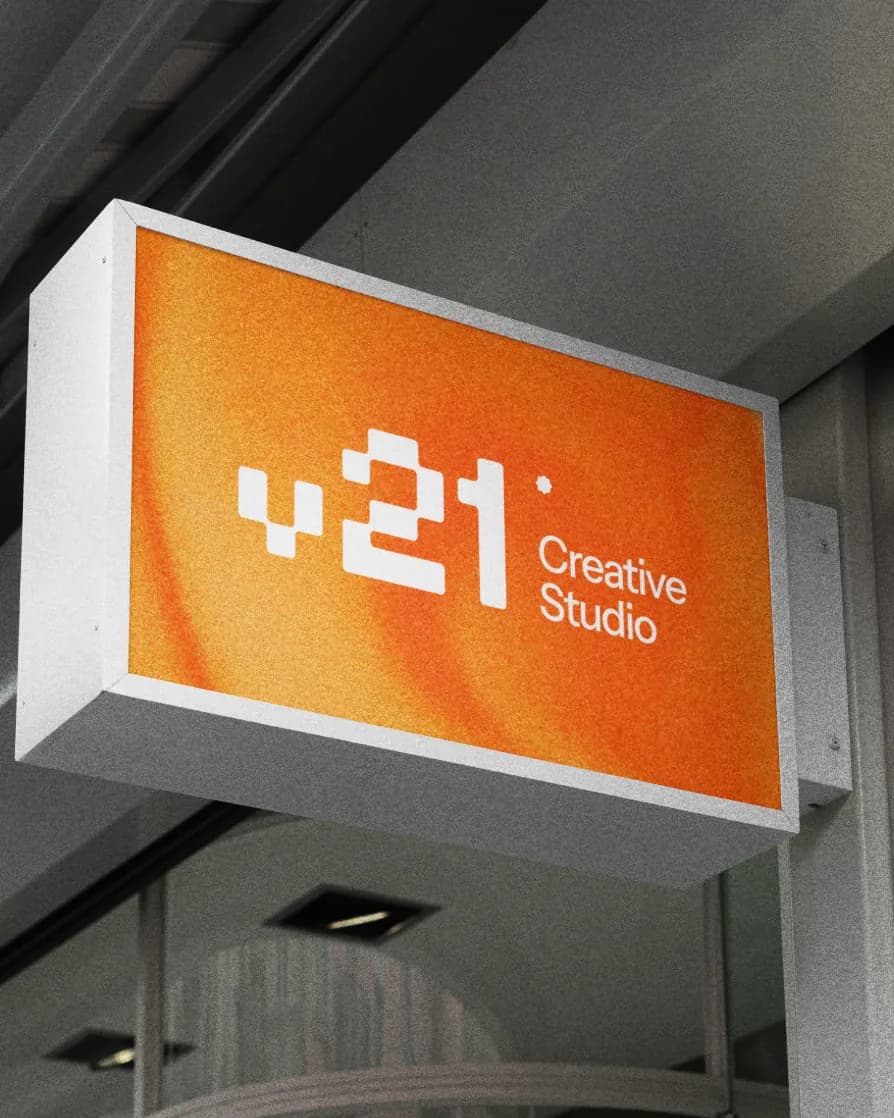
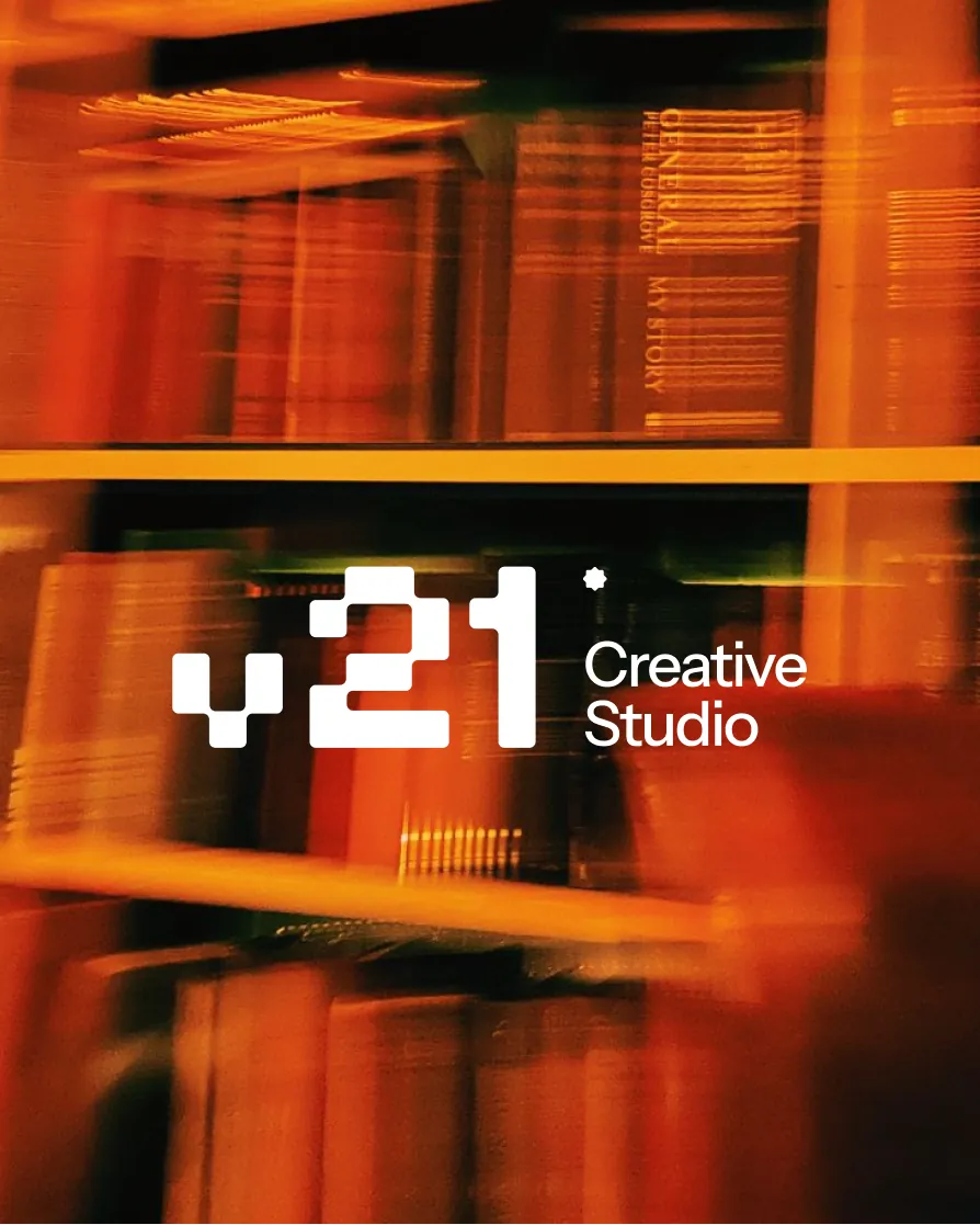
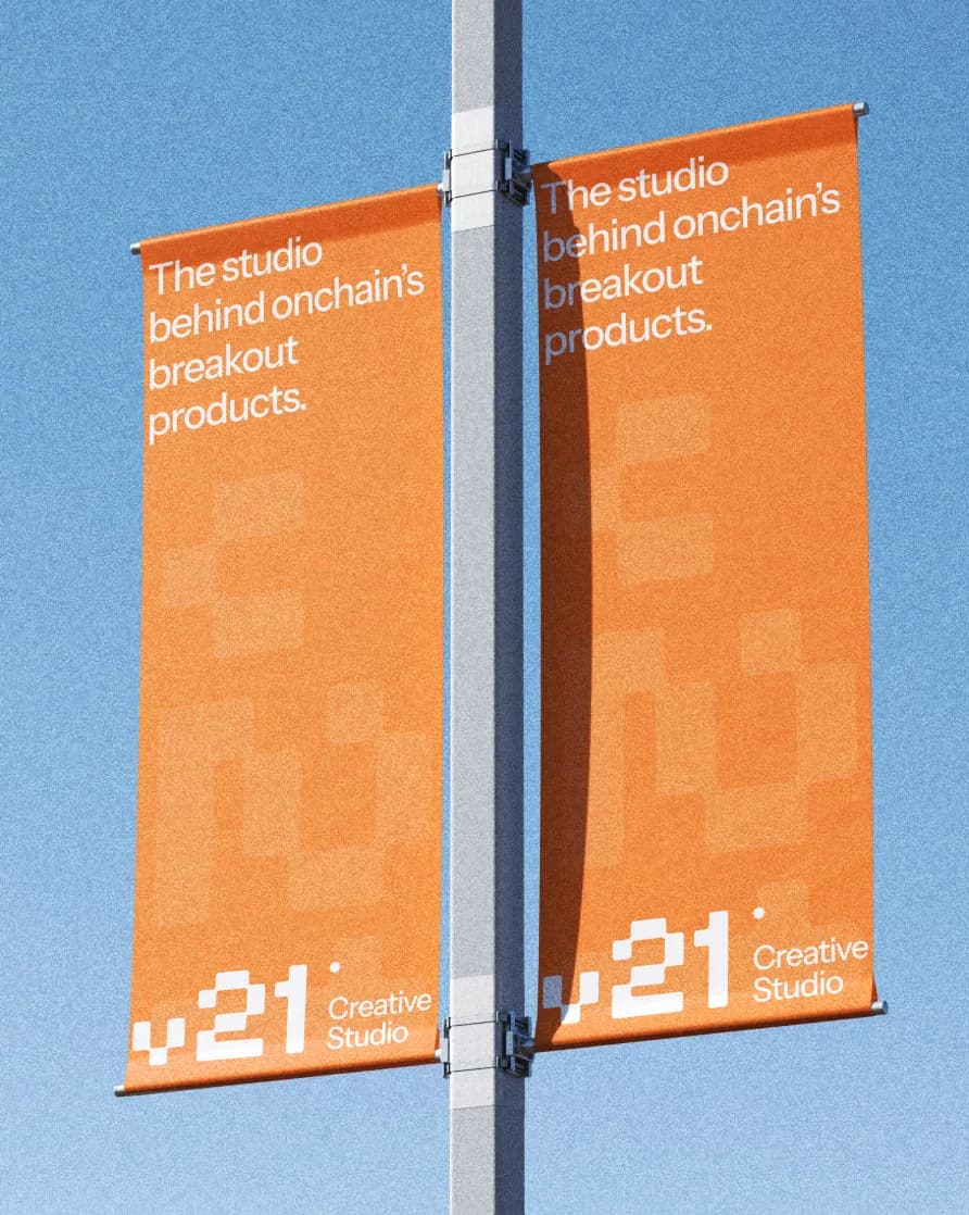
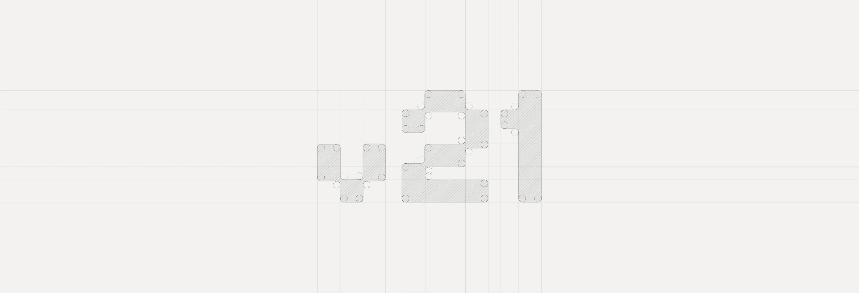
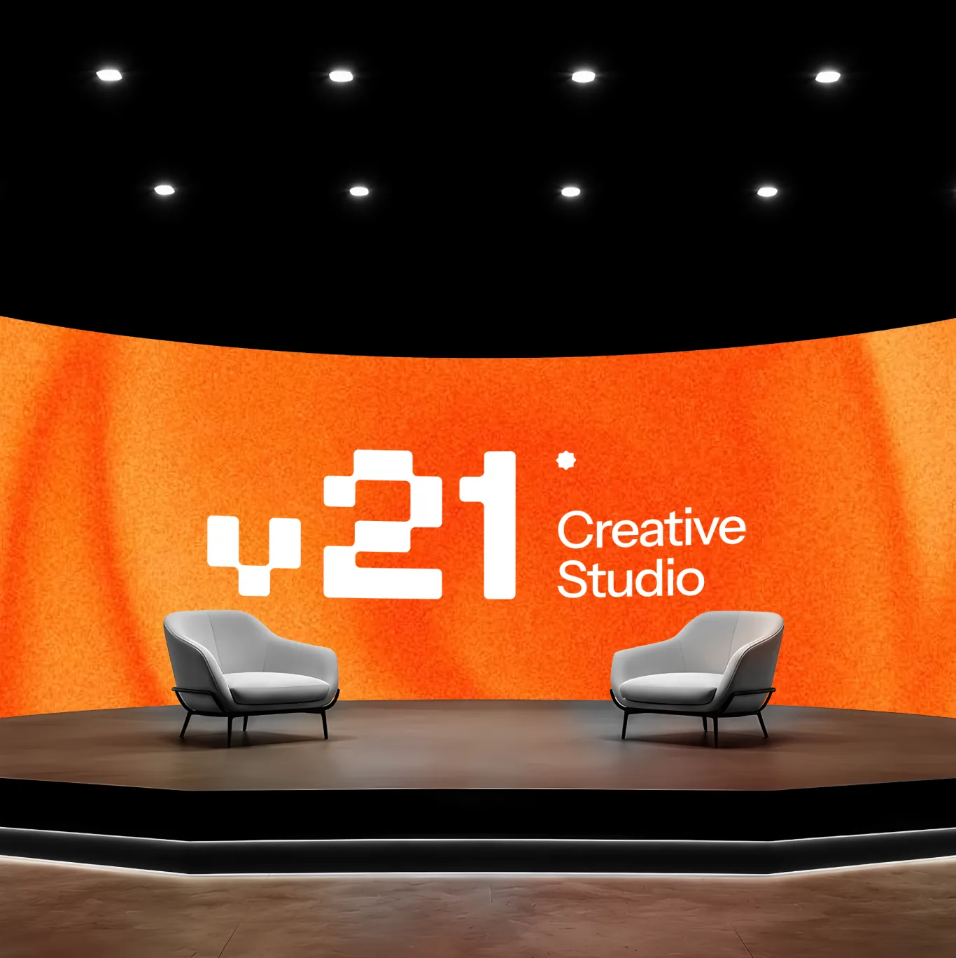
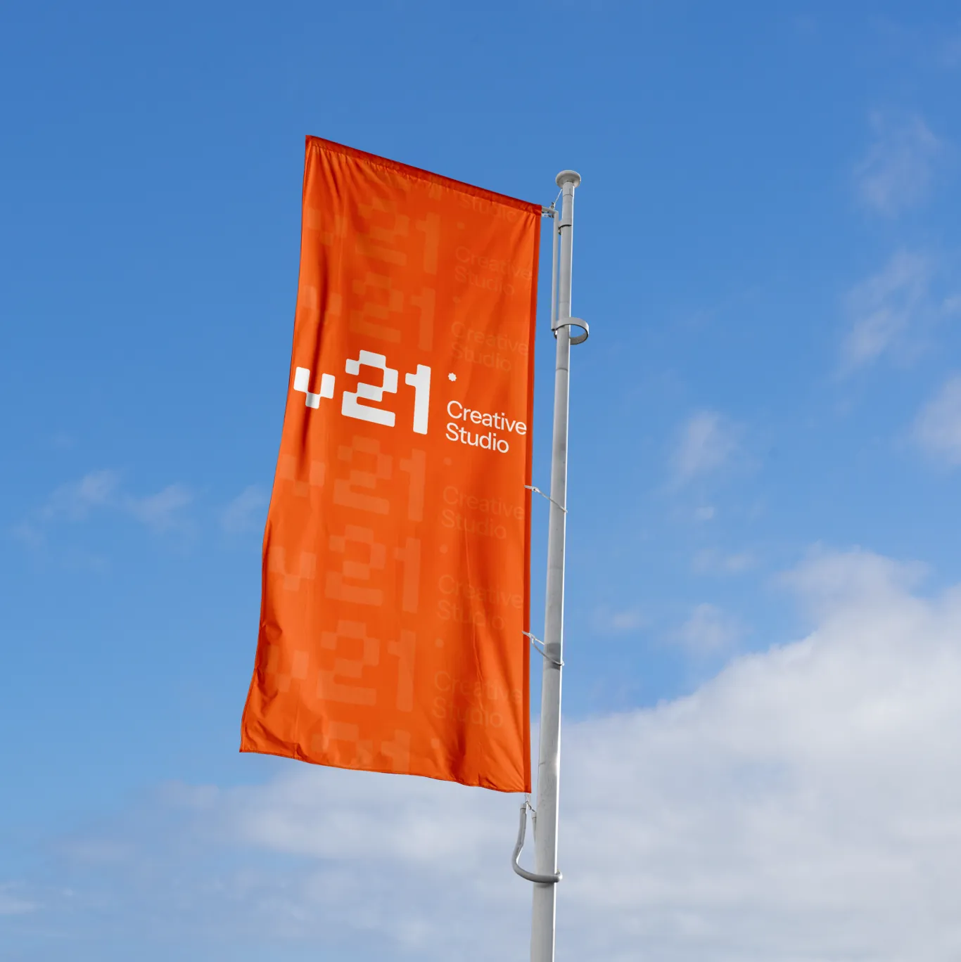
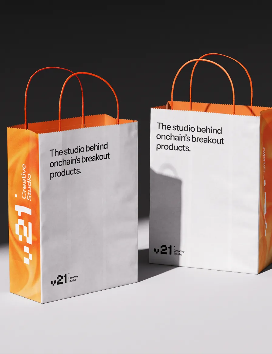
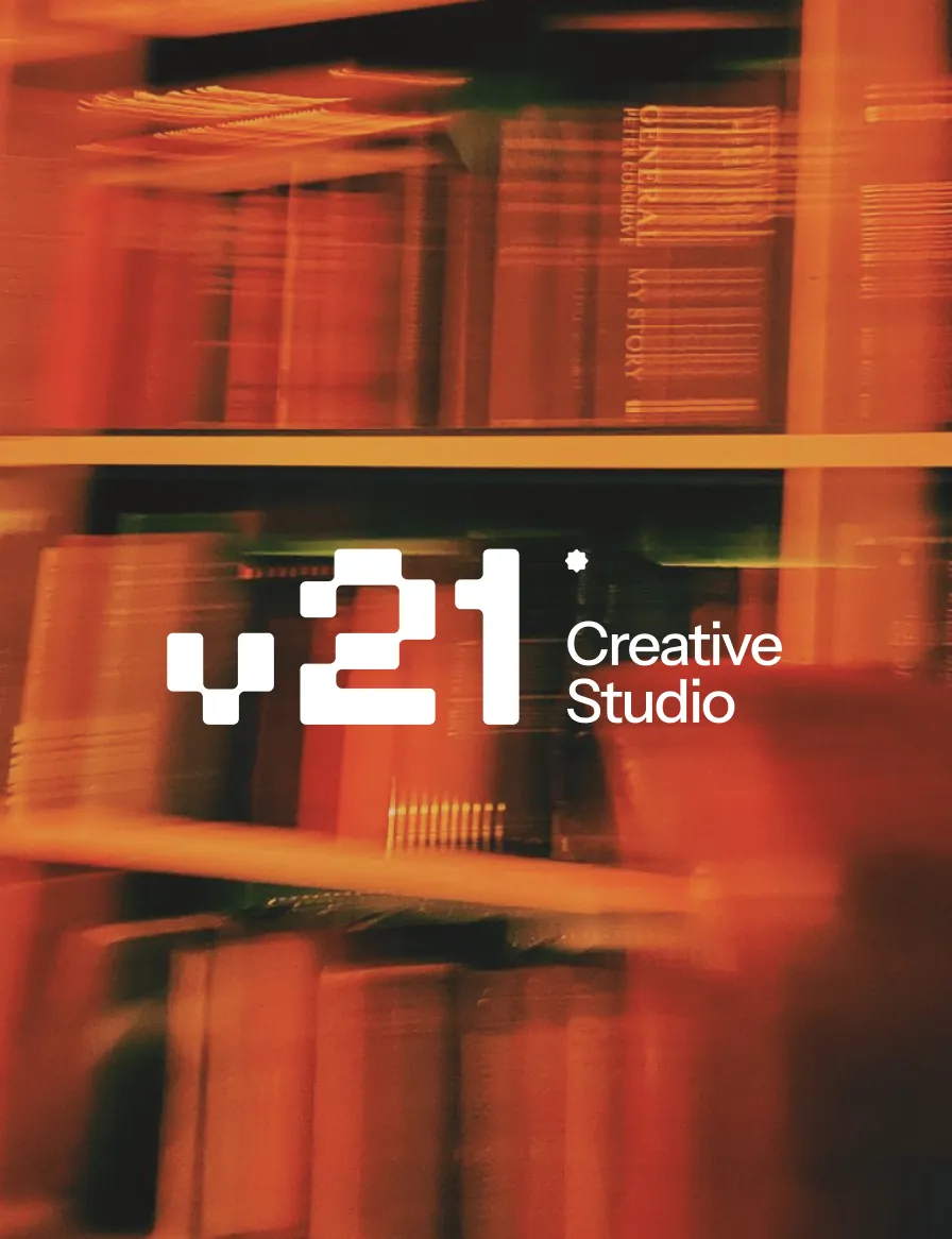
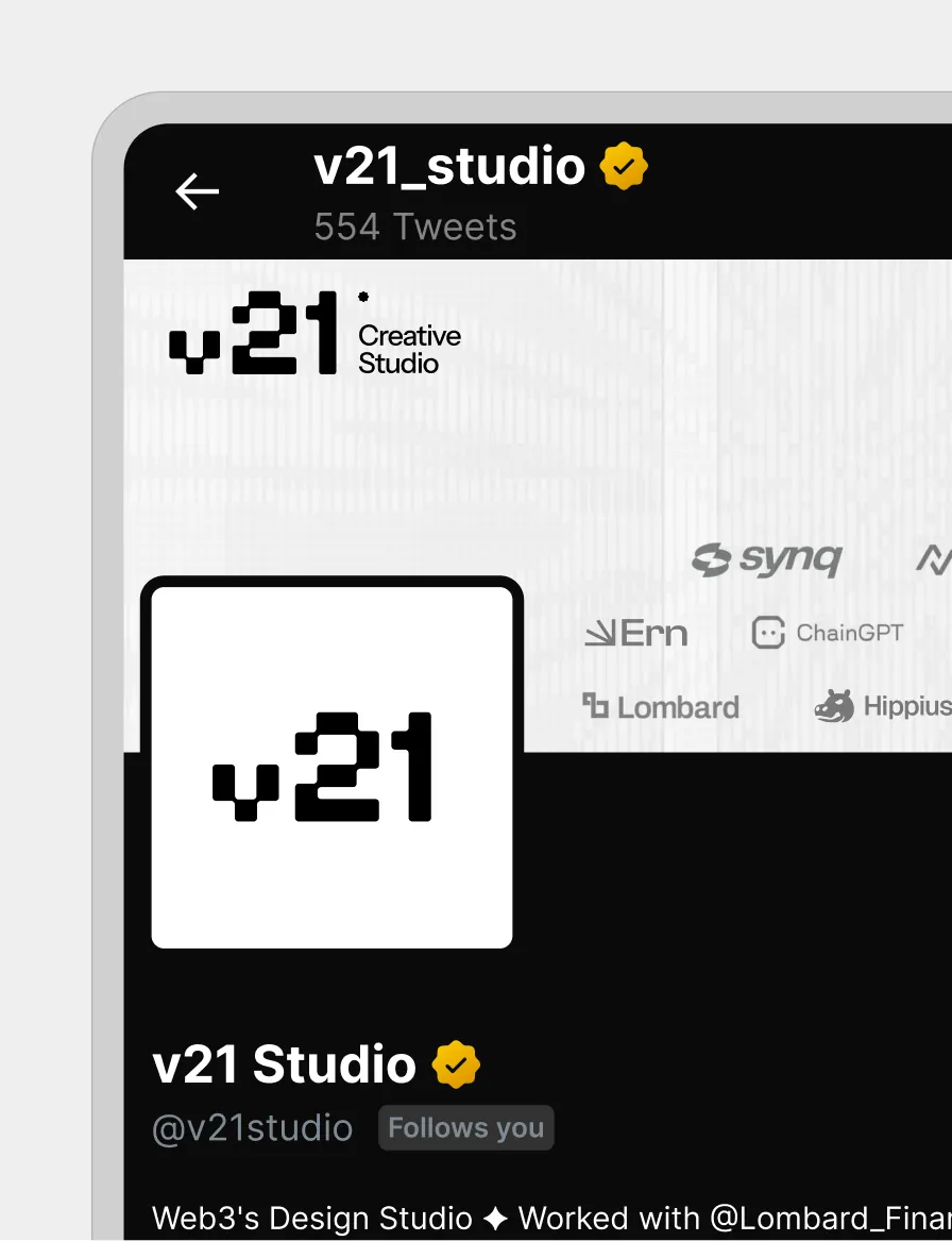
The logo builds “v21” from thick, modular, geometric shapes. Pixel-inspired edges and negative space give it a digital feel. Four lockups cover every context, each with a construction grid, safe space, contrast rules and misuse guidelines.
09Website direction
A website you explore like a room.
We built V21's desk as an interactive 3D scene. Case studies sit on the desk as books you press to open. Testimonials hang on the wall. Visitors hover, explore and find the work at their own pace. The scene is the frame. The client work is what you pick up.
10Iterations
A week and a half of design,
with V21 in the loop.
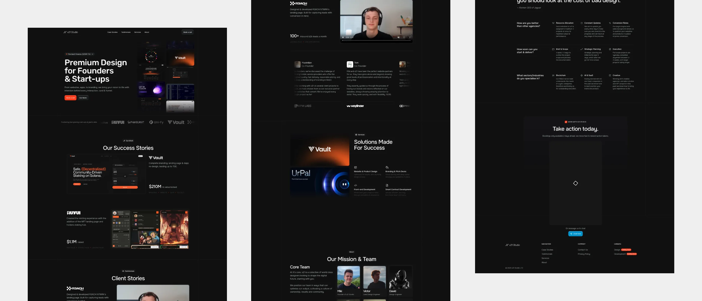
With the brand locked, every round focused on the experience. The layout of the website, how people move through it, and how fast they reach the work.
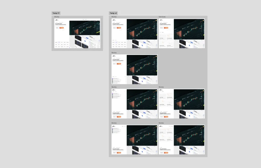
First we tried going with a simpler approach. Having condensed info on the left and the work on the right. We had to pivot from that idea when we realised that it doesn’t fully incorporate the whole essence of what v21 does.
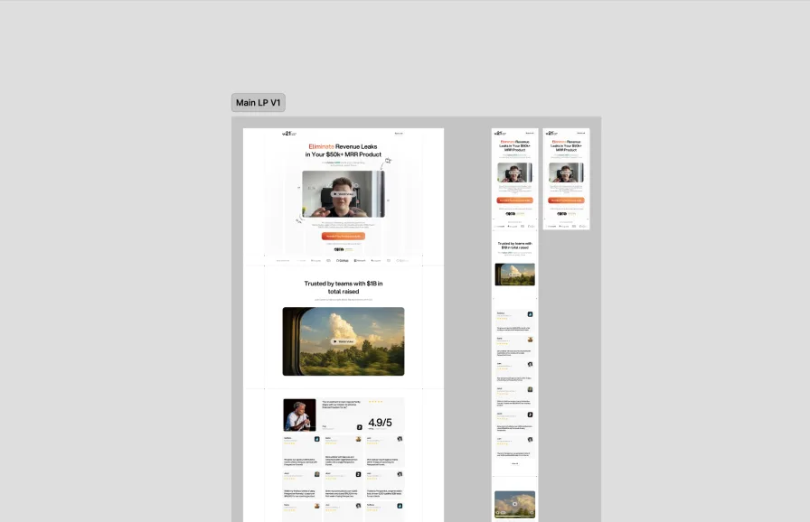
In the second iteration we decided to go with a more traditional approach focused on heavy sales. Lots of numbers and big testimonials.
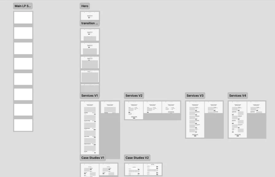
In the end we touched with a classic structure, that showcases step by step, v21’s creativity, what problems they solve and how they solve it.
11Final website
Designed in Figma. Built in Next.js.
Brought to life with WebGL and GSAP.
One week of development, all feedback included. Next.js runs the site, WebGL renders the 3D desk and GSAP drives the scroll animations. A light-mode, interactive site that breaks the dark-techie pattern and puts V21's client work at the center.
- Figma
- Blender
- GSAP
- Next.js
- Photoshop
- WebGL
Video · 16:9
Full site walkthrough
Image · 3:4
Key pages, desktop
Image · 3:4
Mobile
12The result
Client impact
$500k
Generated across 6 months
Partnership
2 Years
Of continuous ongoing support
Revival
Bigger rooms
New niches. Bigger brands. A brand that fits in every one.
NextSomnia